We use email across the QuickBooks ecosystem as an outgoing communication touchpoint to inform, inspire, and empower our customers. Here you’ll find the foundational resources and tools necessary for crafting quality emails for most messaging use cases.
Email
Color
Our email guidelines use a narrowed color scheme from our core color palette. The scale below shows how the primary, supplementary, and accent colors should be used in proportion to each other.

Motion
Animated images are a great way to attract attention in an email and draw the eye to a particular piece of content. However, they’re used sparingly so as not to overpower the email.
Key things to remember:
 Animated images must be a GIF file, with a maximum size of 1MB.
GIF files allow for 256 colors, which can make it difficult to recreate photos within animations without a noticeable loss of quality.
The length of your animation, physical pixel size, and number of colors within the file all impact the file size of your final GIF.
Save animated GIFs as transparent files. Make sure you pay attention to the edge ‘matte’.
The edge ‘matte’ is set to reflect the background it’s designed to sit on. So a light ‘matte’ will look invisible on a light background color.
The previously invisible edge ‘matte’ will become visible if the background color changes, resulting in a loss of sharpness around the image.
Typography
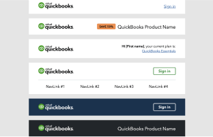
Typography follows the below guidance. All sizes are fixed and should not be changed; however, colors may be updated when needed to best fit your email design. Please note that headline option 01B is reserved for BAM, or with approval during content office hours.

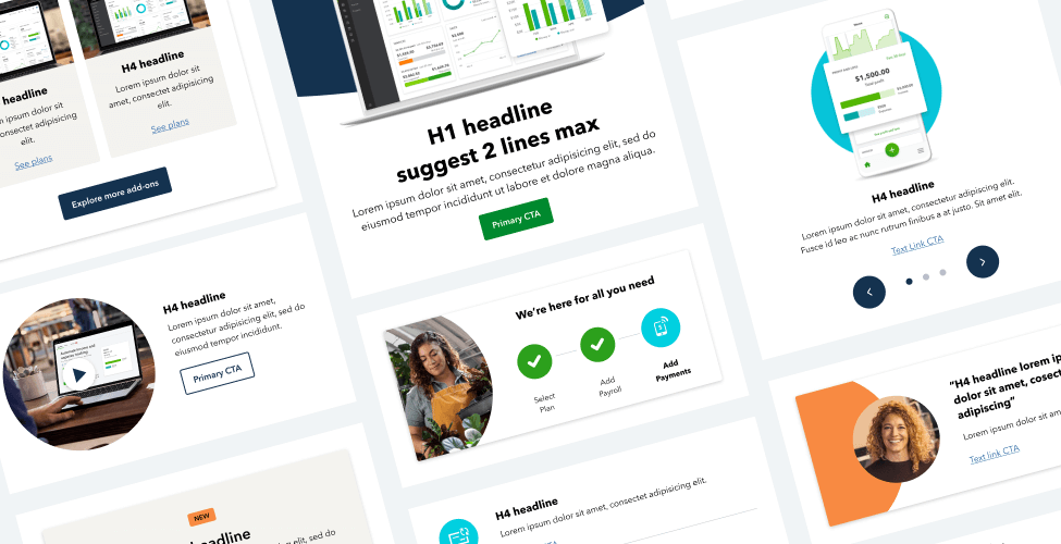
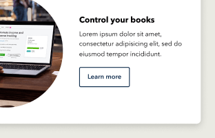
Don’t use too many modules. As a general rule of thumb, keep your email under four components.
Don’t use colors outside the toolkit.

Don’t use headline 01B for headlines without approval from your brand and marketing (BAM) partner.

Don’t use stock photography without approval from your brand and marketing (BAM) partner.
Don’t use Bolt utility illustrations. These are reserved for Accountant emails only.

Don’t use font sizes or styles not included in the toolkit.
Don’t use character counts outside the limits.
Don’t leave behind lorem ipsum, unorganized files, or mislabeled components and images.

Don’t overlay headlines on any imagery.
Available libraries


FY22 QB Brand Photography
Brand approved photos, videos, and testimonials.