Color

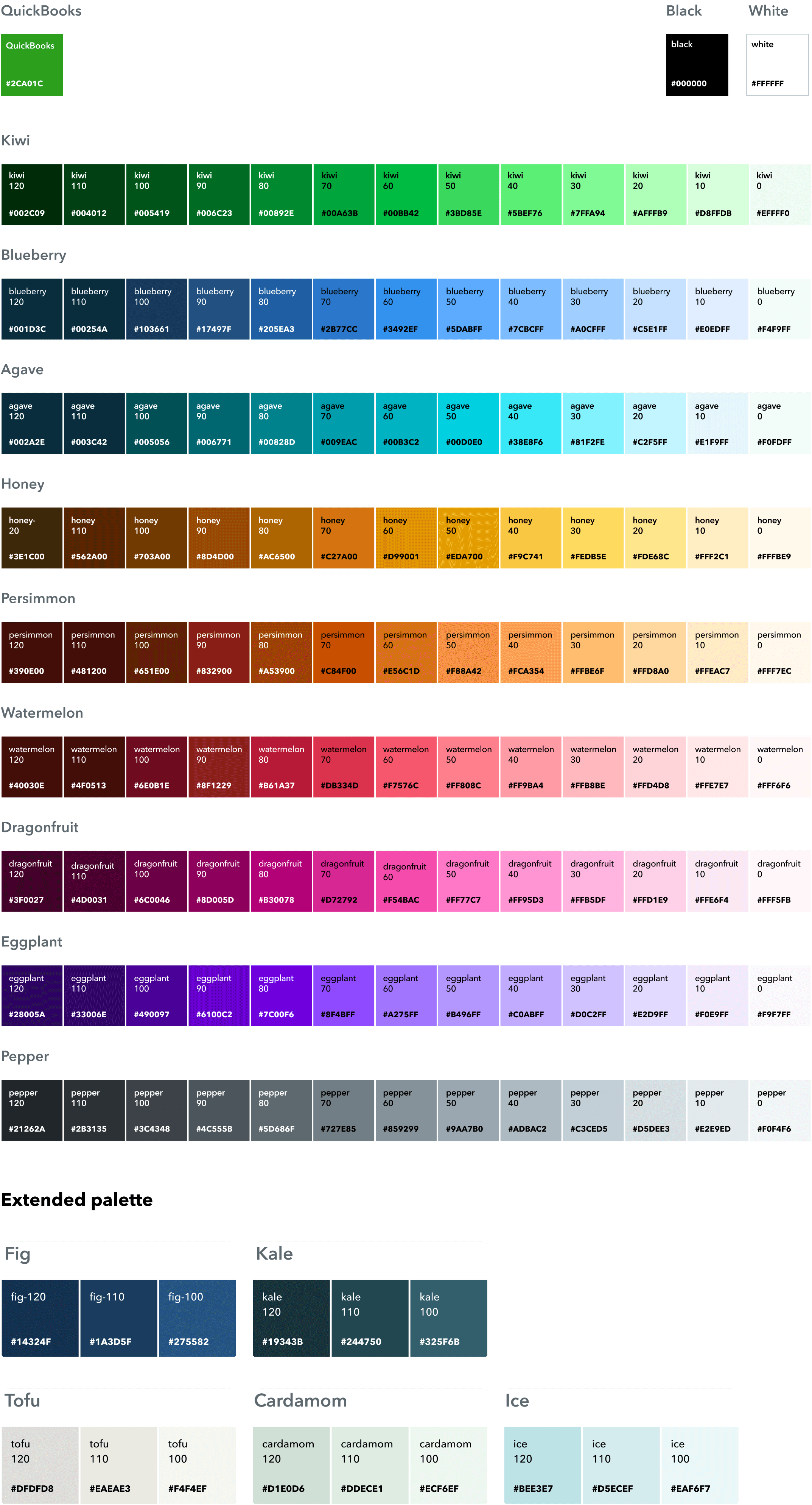
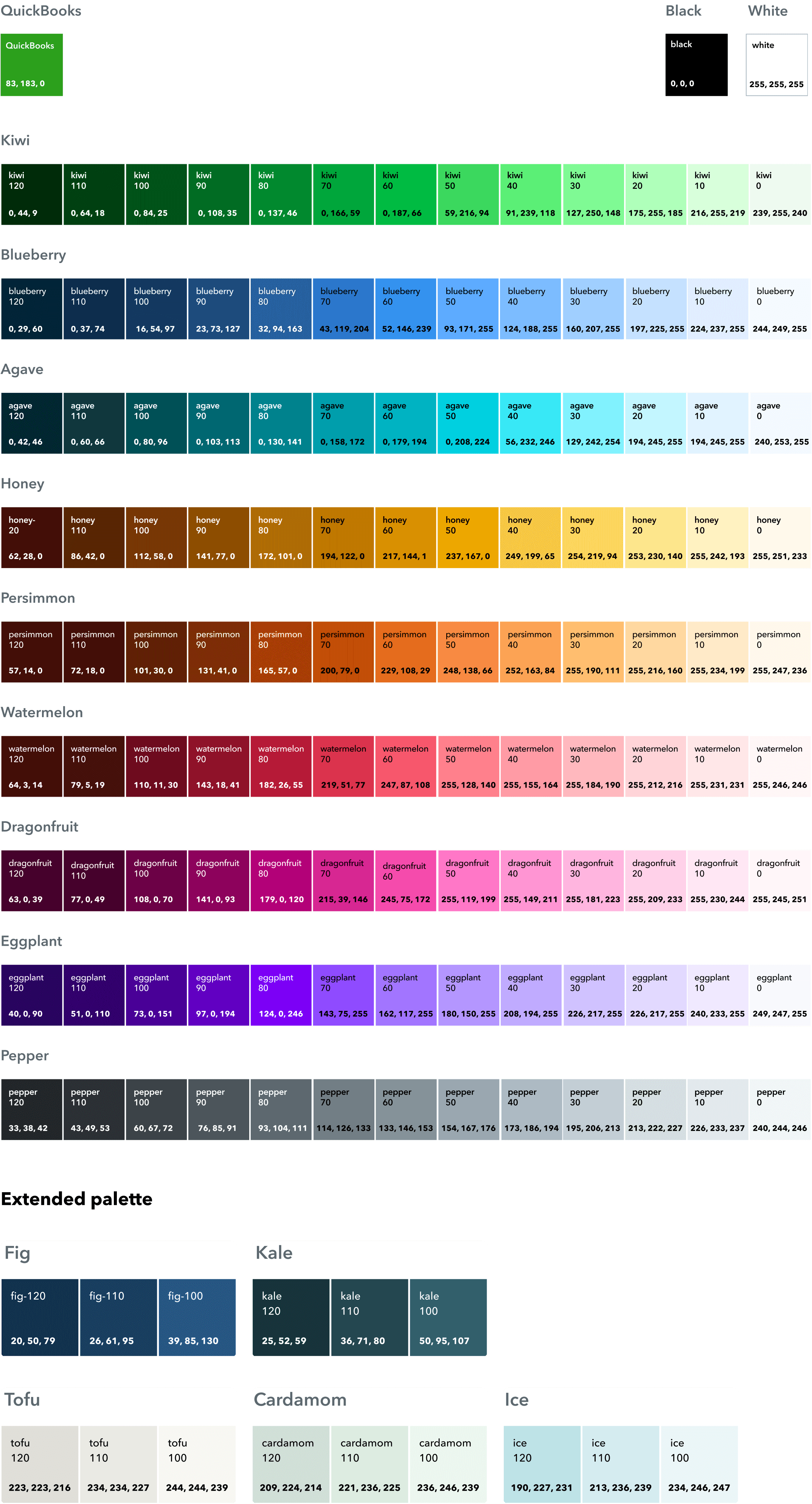
Our modern and unified color palette builds brand equity while solving for accessibility, inclusion, and iteration within product and marketing experiences. The primary QuickBooks brand color palette and proportion are shown below.

Guiding principles

Hierarchy

Use color as a guide for the eye. Color isn’t just there to look pretty—it’s there to attract the eyes to the most important parts of a design.

Accessibility

When designing for digital or print, consider color contrast and accessibility. Don’t let poor color choices stand between your design’s message and a good user experience.

Colors have meaning

Colors have assigned roles, which hold a specific meaning based on how they function within the interface. Defined color roles make things easy to modify and customize later. They also have the same meaning across the color system to convey specific messages or feelings throughout all QuickBooks products.

Color palette

Within the full QuickBooks color palette (shown below), there’s also a primary palette with specific proportion (shown above). When using color for marketing materials, use the primary color palette. The full color palette is reserved for illustrations, and should not be used for general marketing materials.

What not to do

an X on top of a new green square

Don’t create new colors.

unreadable text on top of a color background

Don’t let color impair readability.

two transparent circles overlapping

Don’t manipulate the opacity of colors.

pink text on top of a blue background

Do not use colors together that vibrate or have low contrast.

quickbooks green color swatch

Don’t use QuickBooks green—it’s only reserved for the logo.

quickbooks symbole on light blue background

Don’t use colors that don’t pass WCAG 2.1 AA accessibility standards.

Color usage guidelines

We use our color palette differently in distinct channels to create more visual impact or to follow best practices for each channel.

dark blue text on bright green background

Color usage in social

a mobile phone, a laptop on top of a bright blue circle

Color usage in web

static image of a loading animation on light blue background

Color usage in product

Have work that’s ready for review?

Come to design and content office hours to make sure it’s brand-approved. Agencies and external partners welcome.