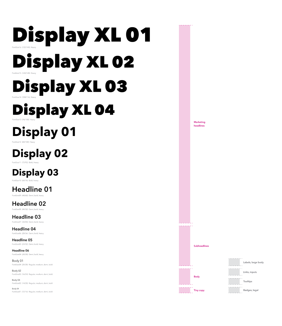
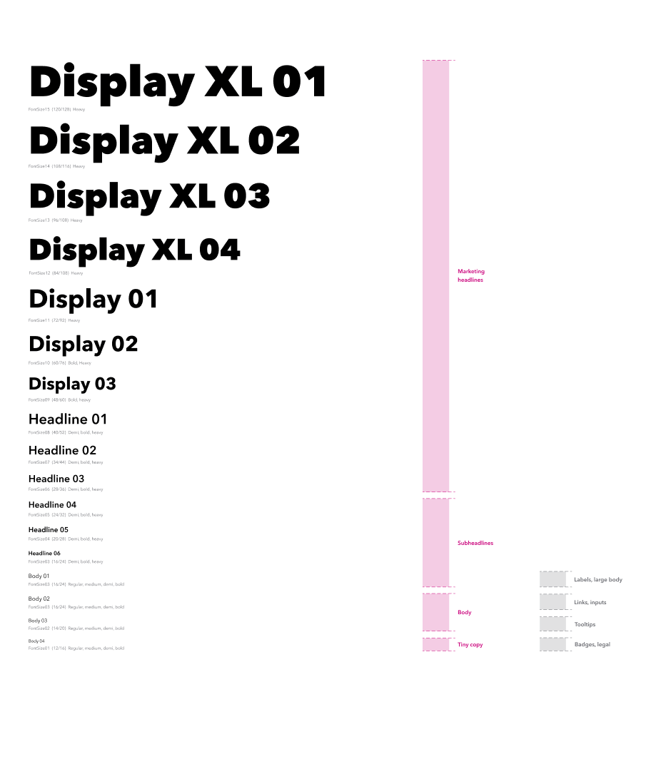
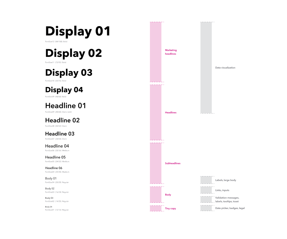
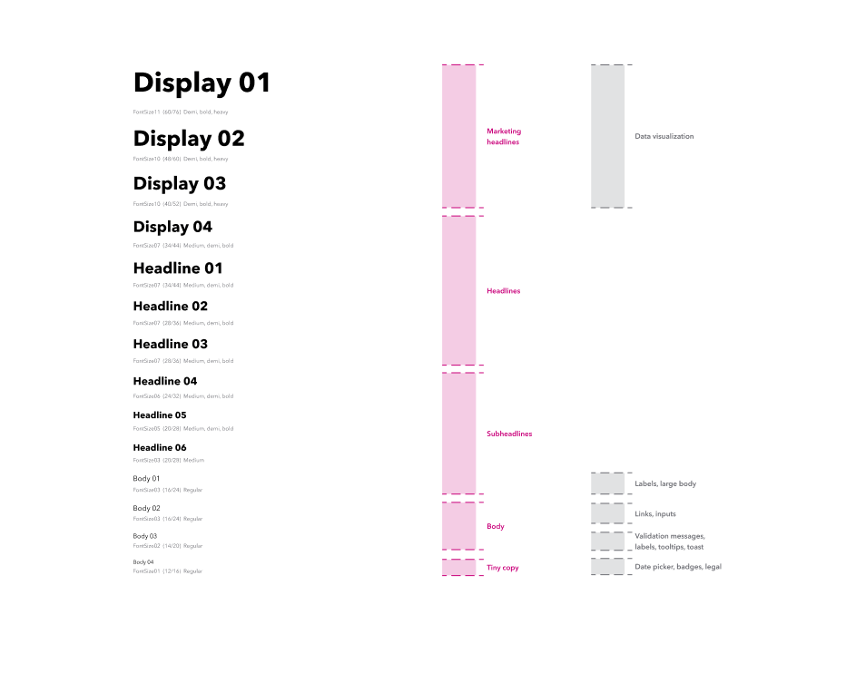
Avenir Next for Intuit is the official primary font for QuickBooks. It’s timeless, yet modern and contemporary, with a large x-height and accurate proportions.
Typography
Guiding principles
Simplicity
We ensure consistency by having fewer font sizes available. If you ever see a font size that’s not represented here, select the nearest value according to the hierarchical requirements in your design.
Clear visual hierarchy
Good typography doesn’t need many style changes to create clear hierarchies. Aim for no more than 3-5 weights on any given page.
Type scale
All elements in our design system need to fit on a 4-pixel design grid. We measure typography by box bounding. Make sure to enter the type size and line height to get the right sizing.
The basics
Sentence case
We use sentence case in all of our content by default. This means we capitalize only the first letter of a sentence, and the rest of the words in the sentence begin with lowercase letters, unless they’re proper nouns.
All caps
All caps can be used, but must be used thoughtfully so it doesn’t seem like we’re yelling at our audience. It’s acceptable to use all caps for short headlines (no more than 5 words) or for emphasis of key benefits.
Avenir Heavy
We use Avenir Heavy font weight exclusively for all caps. It’s meant for those use cases when big visual or messaging impact is needed.
Emphasis
A pop of color can be used to emphasize important messages. Colored fonts should always be accessible. The emphasis should always be on a user benefit, should be limited to 2 words max, and should only be used on positive words and phrases.
What not to do
Don’t use Avenir Heavy font weight for sentence case text.

Don’t use all caps for long headlines.
Don’t emphasize QuickBooks.
Don’t use inaccessible or illegible colors for text.
Avoid having descenders and ascenders touching.

Don’t place text on busy backgrounds.
Have work that’s ready for review?
Come to design and content office hours to make sure it’s brand-approved. Agencies and external partners welcome.
© 2026 Intuit Inc. All rights reserved.
Intuit, QuickBooks, QB, TurboTax, Mint, Credit Karma, and Mailchimp are registered trademarks of Intuit Inc. Terms and conditions, features, support, pricing, and service options subject to change without notice.
By accessing and using this page you agree to the Terms and Conditions.
