The QuickBooks logotype is the main identifier of the brand. It represents the QuickBooks story as a stand-alone element. In visually overwhelming spaces, it also takes a stand against competitors and opposing messaging and must be treated with great care, protecting its integrity at all times.
Logo
The basics
Preferred logo
To maintain consistency, we strongly recommend using our primary logo variation whenever possible. In the event that this logo variation is not suitable for your specific use case, please reach out to our brand team for further guidance.
Clear space and minimum size
Think of clear space as an invisible space around the logo artwork that protects its legibility and integrity. No visual elements should be placed inside of it. The margin should be half of the height of the QuickBooks symbol. This rule applies to any logo variation.
The minimum size protects the clear legibility of our logotype. The QuickBooks symbol in any logo variation can never be displayed under 16 pixels for digital (at 72dpi)
Logo variations
While the primary logo should always be your first option, the alternate variations can be used to fit different background colors. There has to be high contrast and the logo should always be perfectly legible. Below are approved background colors and logo combinations. Please note that the black and white logo option should only be used for print purposes and not for digital media.
Reversed logo in color
Black and white logo (single color print only)
Reversed logo (single color print only)
Tofu-100
Ice-100
Fig-120
Logo lockups
Use AvenirNext for INTUIT Medium in black for product names. The cap height should be at the 2/3 height of the logo symbol. Product name should always start with the word QuickBooks (for example, QuickBooks Self-Employed).
The proportions are fixed, but placement of the product name is flexible, and will vary by asset and context. Maintaining the minimum distance of 2x from the logo is key.
Partner logos are separated by a vertical pipe. The QuickBooks logo should always be on the left side of the pipe.
Intuit cornerstone brand logos presented as a bundle or product integration are separated by a plus sign. There should be no more than 2 brands represented.
The pipe and the plus sign color is #5D686F.
Learn how to co-brand partner-owned materials while staying compliant with QuickBooks brand design guidelines.
What not to do
Don’t alter the QuickBooks logo in any way.
Below are some examples of what not to do with the QuickBooks logo in order to protect its integrity.
Don’t separate the symbol from the type treatment of the mark.

Don’t place the logo on a background pattern, busy image, or illustration.
Don’t add a product name with the logo.
Don’t put the QuickBooks logo in a containing shape.
Don’t place the logo on a green background, as this is against our accessibility guidelines.
Don’t place the logo on a solid background color that isn’t approved.
Exceptions
QuickBooks symbol
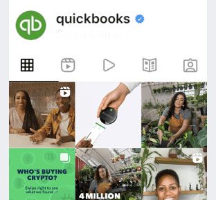
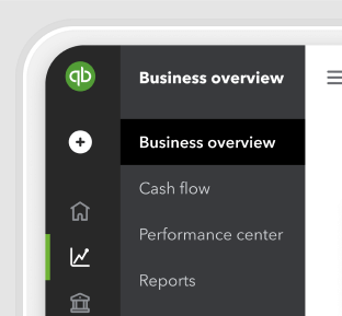
In space-constrained assets (social media platforms, in product, app icons, and so on), the QuickBooks symbol can be separated from the wordmark.

Social media platforms

In QuickBooks product

App icon
Downloadable assets
Have work that’s ready for review?
Come to design and content office hours to make sure it’s brand-approved. Agencies and external partners welcome.
© 2026 Intuit Inc. All rights reserved.
Intuit, QuickBooks, QB, TurboTax, Mint, Credit Karma, and Mailchimp are registered trademarks of Intuit Inc. Terms and conditions, features, support, pricing, and service options subject to change without notice.
By accessing and using this page you agree to the Terms and Conditions.