QuickBooks’ design for social captures the vibrancy of small business owners. Our design language is friendly, honest, and optimistic. This allows us to speak to our followers in a person-to-person way, and create a genuine connection with our audience.
Example posts
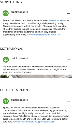
There are several kinds of social posts designed to connect with followers and encourage engagement. Below, you’ll find rationale and examples of effective social posts that fall into 3 main categories: The hustle, The skills, and The tools, as well as tone priority guidance for each category.
Purpose
Inspire our audience, motivate them, and make them feel like part of an impactful community.
Methods
- Storytelling - Emotional and unique small business stories.
- Motivational - Business success stories, motivational quotes.
- Cultural moments - Roundups and stories spotlighting specific communities.
Tone priorities (ranked in order used)
Confident
Genuine
Warm
Purpose
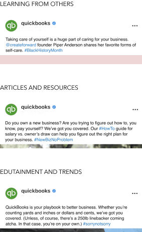
Empower our audience with wide-ranging business knowledge and tools so they can be in control of their own destiny.
Methods
- Learning from others - Learn from community, experts, or influencers.
- Articles and resources - Quick links, step-by-step lists, easy to read/understand, high value, thought leadership.
- Edutainment and trends - Social engagement, Q&A, quizzes, polls, etc. that are timely and relevant.
Tone priorities (ranked in order used)
Confident
Warm
Genuine
Purpose
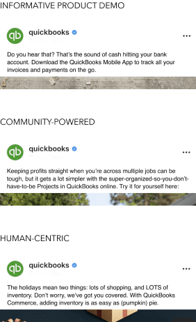
Help our audience understand how QuickBooks can contribute to their success, whatever success looks like to them.
Methods
- Informative product demo - Simple, non-promotional, informative storytelling.
- Community-powered - People with product, community recommendations, reviews, testimonials.
- Human-centric - Speaks to the audience directly, showcases people with products.
Tone priorities (ranked in order used)
Genuine
Confident
Warm
Functional notes
Emojis
Consider how emoji usage impacts our tone. Does it add levity to a post that needs it? Or is it undermining the impact of what we’re trying to say?
We’re comfortable using emojis, but with certain considerations.
- Try your best to stick to more common emojis.
 Never use an emoji to replace or duplicate a word.
Never use an emoji or series of emojis that can be read as suggestive.
Never use emojis in thought leadership copy.
Never use more than 3 emojis in one post (and even then, use best judgment).
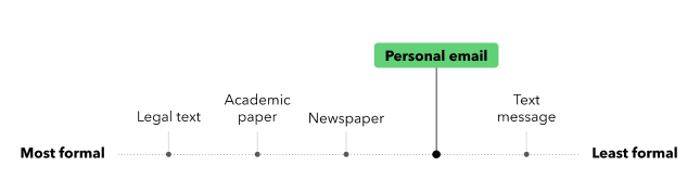
Level of formality
There’s a familiar relationship between the reader and writer. Our social posts should sound casual and conversational, but not as casual as a text.
How we handle the details
Customers don’t usually notice editorial style unless we get it wrong. Follow these guidelines to make sure editorial errors don’t distract users from moving forward.
Bookmark the Content at Intuit site for easy access to word lists, formatting and punctuation resources, and much more.
- Stick to sentence case.
- Capitalize QuickBooks correctly (capital Q, capital B).
- Use (and format) hyphens, en dashes, and em dashes correctly.
- Follow conversational norms over grammar rules.
- Use first person plural (we, us, our).
- Use common contractions.
- Use exclamations sparingly. They should be reserved for true celebratory moments only.
- Write in active voice.
Never refer to QuickBooks as “QB”.
Avoid corporate and technical jargon.
Primary palette
This palette is used to build QuickBooks brand equity. It serves a dual purpose in social assets: it provides a clean foundation for important content to stand out, and also enables pops of bold color for added vibrancy when needed.

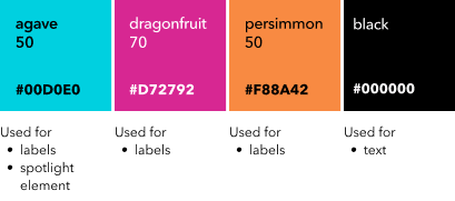
Limited usage colors
These colors have specific usage, which helps us maintain consistency across different assets.
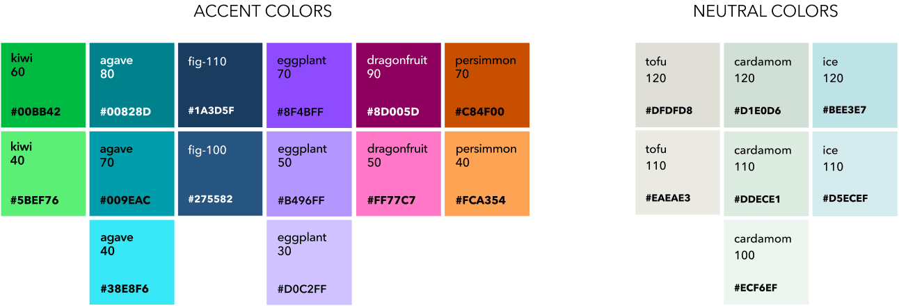
Extended social palette
These colors are created to enhance the experience in social environments, enable more robust storytelling, and support cultural events.
Usage of these colors should be thoughtful, minimal, and always in conjunction with our primary color palette. Accent colors should never dominate.
Color proportion
Use color in a purposeful way, to help create clarity and visual hierarchy.
A neutral color set is mostly used for backgrounds. A vibrant color set is used to add visual interest to a story, or to add clarity to our data.

Color usage examples
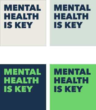
Neutral backgrounds
A set of neutral colors are mostly used for backgrounds. They can work in combination with various types of visual elements, including typography, photography, illustration, and more.
Bold backgrounds
Bright colors can also be used for backgrounds, but they have to be from our primary palette. These color backgrounds work well in typographic layouts, promos, and simple graphics.
Colors from the extended color palette can be used for assets intended to mark cultural events like Women’s History Month, Black History Month, Pride Month, Small Business Month, and more.
They should exclusively be used as accent colors to create recognizability and visual continuity for all assets in the series.
All other visual elements should remain grounded in our foundations (primary color palette, fonts, layouts, and labels).
The extended color palette can be used to visually highlight data. It provides a platform for a broad variety of executions, including dimensionality, image matching, and/or vibrancy.
Accompanying visual elements should still come from our foundations, like the primary color palette, typography, layouts, and labels.
Type setting
Line height: 100%
Letter spacing: 0
Text align: left
If you’re mixing fonts, compose your content so that the emphasized benefit text is at the end of the sentence.
If your descenders and ascenders are touching, then the leading should be increased.
Graphic elements
We have various graphic elements which help us achieve a cohesive look across various social assets.
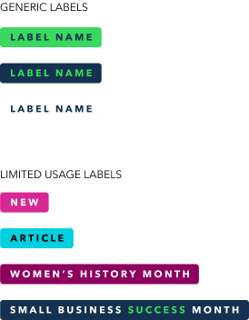
We use labels to categorize topics. They look like buttons or tags, but people can’t select them. Labels have several color variations.
Use generic labels for any category.
Limited usage labels are exclusive and should not be used for any other category. Only choose categories from the approved list.
Additional limited usage labels require special approval.
Colors, typography treatment, and categories are fixed.
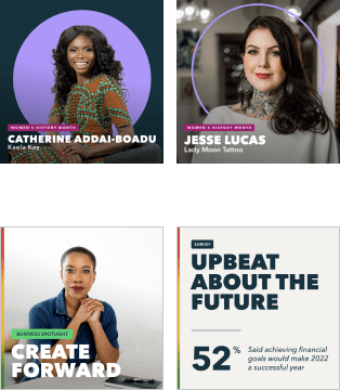
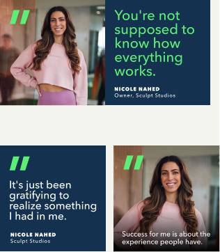
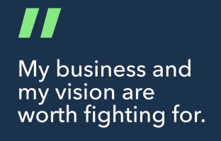
A circular frame is used to spotlight small business owners. It’s placed in the center of the layout, without any other visual elements.
Images are flexible.
- Frame colors are flexible.
- Use frames for business owners only.
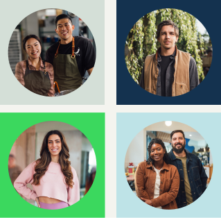
Quotations relate to the person in the image.
- Select an image that isn’t too cluttered, so quotes have proper contrast.
- Quotation mark color is flexible to complement the colors in the image.
- Quotation mark size and placement are fixed.
- Quotations as graphic elements should only be used in our templates.
- The quote can either be separate from the image (e.g. carousel), standalone, or combined with an image.
Native elements
When adding text natively on TikTok, Instagram Reels, and Stories, we primarily use white and/or black text and backgrounds to ensure that the text is accessible.
We use the same native font style for consistency.
YouTube thumbnails and end cards
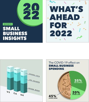
Thumbnails are the first impression we make on YouTube, and are designed to encourage the audience to watch our content. We’ve developed templates (available to download at the bottom of this page) to simplify building thumbnails for various types of content, including:
- Brand marketing & product explainer videos
- Panels, roundtables, Q&As
- Product webinars and tutorials
Template layouts are fixed and only some elements have a certain level of flexibility.
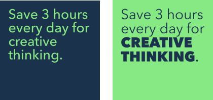
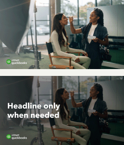
Brand marketing and product explainer videos
- Use bold, full bleed images.
- Add text overlay only as needed.
- Copy should be in sentence case and up to 5 words in length.
Don’t change text size and position.
Don’t use labels.
Don’t add any other visual elements.
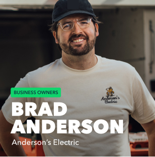
Ask the Expert and Webinar videos
- Headline copy is flexible and should be in sentence case. Limit to 40 characters.
- Layout, font sizes, and colors are fixed.
- Primary labels (in all caps) are fixed.
- Secondary labels (in sentence case)
- Color and font size are fixed.
- Copy is flexible. Max 26 characters.
- Adjust label length to accommodate text.
Don’t change the shape and position of the image.

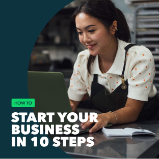
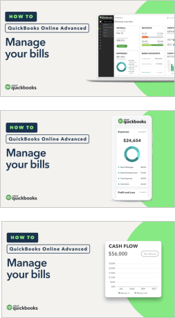
How-to videos
- Layout, font sizes, primary label, and colors are fixed.
- 3 product representations fixed (mobile, laptop, and a card).
- Shape of the extracted product UI card is flexible, to accommodate various UI.
- Product UI screens are flexible.
- Headline copy is flexible and should be in sentence case. Limit to 25 characters.
- Secondary labels (in sentence case):
- Color and font size are fixed.
- Copy is flexible. Max 26 characters.
- Adjust label length to accommodate text.
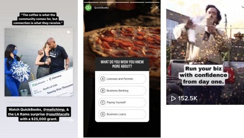
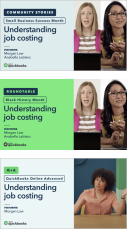
Community Stories, Roundtable, and Q+A
- Layout, font sizes, primary labels, and colors are fixed.
- Headline copy is flexible and should be in sentence case. Limit to 25 characters.
- Secondary labels (in sentence case):
- Color and font size are fixed.
- Copy is flexible. Max 26 characters.
- Adjust label length to fit text.
- Up to 2 images can be used in the image area, either side to side or stacked.
- “Featured” names section is optional, and recommended if the names are recognizable. Remove the divider line if there are no featured names.
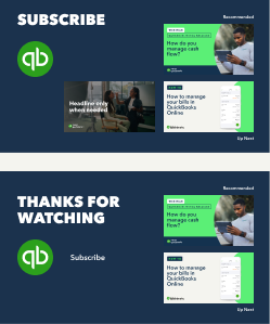
End cards
Effective end cards keep our audience engaged and encourage them to discover and watch additional branded videos from QuickBooks.
- If the embedded elements include a link or more than two videos, use either the "Subscribe" headline version or “Thanks for watching”.
- The QuickBooks symbol can be used either as a subscribe button or a link to a QuickBooks domain, but not for both in the same layout.
People
We strive to feature a broad range of people with varying ages and ethnicities, and a wide variety of businesses. Show the people in action, engaged with their work, and looking at the camera, inviting the viewer in. Show various business settings and geographical environments.

Objects
Objects can be shown both wide and close up. They should look appropriate to a particular setting. They should not appear particularly new or overly art-directed and staged.

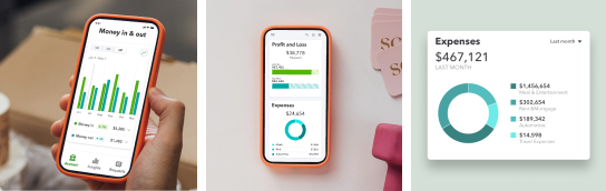
Product UI
Our product can be shown in the context of the small business owner’s world or standalone. Incorporating hands holding the phones adds a human element to images.
Showing product on a simple color background, with or without a stylized device, is OK.
Don’t use over-processed or blurry images.
Don’t show business owners in a setting that doesn’t reflect their business.
Don’t use images that look too casual or unprofessional.
Don’t show environments that look sloppy or messy.
Don’t use stock images of people pointing at computers.
Don’t use stock images of people acting happy.
Available assets
Layout templates and graphic elements for social

YouTube thumbnail and end card templates
