Paid advertising is an important way to introduce potential customers to both our QuickBooks products and our brand. Ads must be carefully designed to capture attention quickly and convey important messages clearly, without sacrificing brand equity.
Best practice is to choose the top-performing creatives currently live and in market, and overlay the promo message. This helps to expedite the creative production process.
Avoid fear-based or overly urgent language. This includes phrases like:
- Hurry! Don’t wait!
- Time is running out!
- This is your last chance!
You can express enthusiasm with exclamation points—just make sure they sound like a natural reaction to the situation. They work best with single words and short phrases.
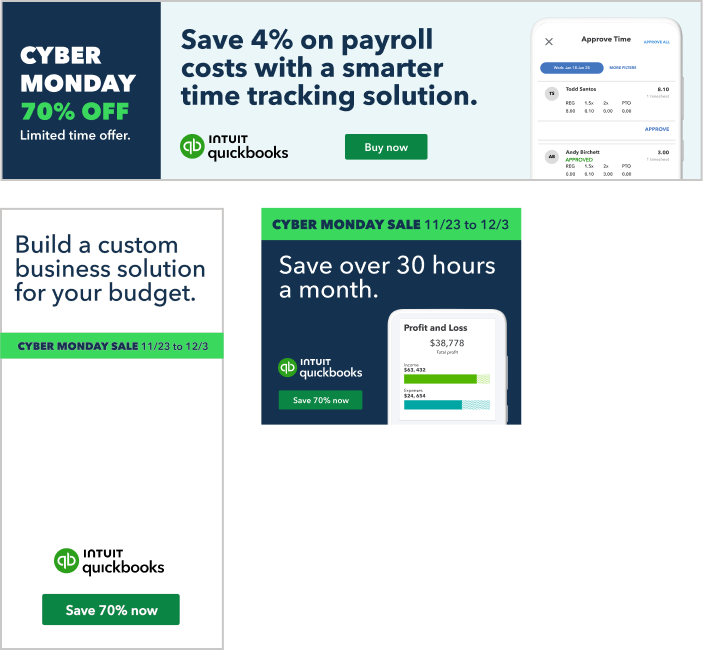
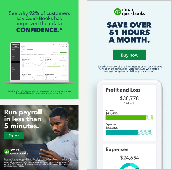
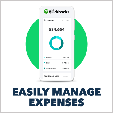
Quantifiable claims shown in the first and second frames are effective in driving performance at bottom-of-funnel (BOF) efforts. Claims can be used to substantiate reasons to believe (RTBs) shown in the 1st frame as well.
All claims must be current. If you’re not an Intuit employee and want to use claims, please ask your QuickBooks partner for available claims.
When using claims, you must also use the appropriate disclaimer symbol(s) and follow all Legal-approved disclaimer guidelines, which you can access via your QuickBooks partner. Disclaimer language can be omitted from the asset if the user can reach a landing page that shows it within 1 click from the ad exposure.
When a legal disclaimer is required, this should be included within the asset, not the post copy.
Disclaimers should:
- Be displayed in at least 10-pt font
- Be clearly legible
- Appear for a sufficient length of time to be read and understood
For products that involve Green Dot Bank, the “not a bank” disclosure should be bolded.
Work with your LCPO contact to condense the length of disclaimers for social where possible.
Copy within CTA buttons should summarize what specific action you’d like the reader to take in relation to the ad copy.
CTA copy should be 2-3 words, in sentence case, with no punctuation.
Some exceptions may be made for 4 words in rare cases; however, there’s almost always a way to shorten a longer CTA into something that’s 3 words or less.
Learn more about CTA copy guidelines here

Functional notes
Level of formality
There’s a familiar relationship between the reader and writer. Our performance media ads should sound casual and conversational, but not as casual as a text.
The same guidelines apply to writing for performance media and social. Check out the Social page for additional functional notes.
Limited usage colors
These colors have specific usage, which helps us maintain consistency across different assets.
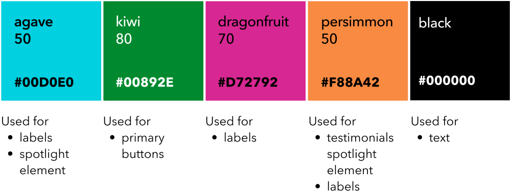
Extended palette
These colors are created to enhance the experience in social environments, enable more robust storytelling, and support cultural events.
Usage of these colors should be thoughtful, minimal, and always in conjunction with our primary color palette. Accent colors should never dominate.
Color proportion
Use color in a purposeful way, to help create clarity and visual hierarchy.
A neutral color set is mostly used for backgrounds. A vibrant color set is used to add visual interest to a story, or to add clarity to our data.

Most commonly used on Instagram in-feed, Facebook, LinkedIn, and carousel posts on Twitter. Must be used for any carousel posts that will be supported with paid media.
Note
Since 1:1 can be leveraged across most platforms, this is the ideal aspect ratio if scope is limited and you need to leverage the same asset across multiple placements.
Optimal ratio for image and video paid ads on Facebook and Instagram.
Instagram thumbnails crop at 1:1 in grid view. When publishing Instagram posts, only use 4:5 ratio when the thumbnail doesn’t crop out text or design elements. Otherwise, use 1:1.
Note
- The circular frame design element can be published to Instagram at 4:5 since it doesn’t crop out key elements.
- Paid carousels on Facebook/Instagram must be 1:1.
When creating an image-only post on Twitter, images are cropped at 16:9 when viewed on mobile.
If an image is uploaded at a different size, it will be viewed at 16:9 in feed and expand to the full size when selected.
Note
If you upload an image that isn’t 16:9 to Twitter, make sure that important elements (faces, text, etc) aren’t cropped out when the image is viewed at 16:9.
Used for Instagram Stories, Reels, and TikTok.
When designing creative, ensure key elements are kept within the safe zone for the platform.
- Instagram applies a gradient so that all of their UI will be visible, no matter the color of the post.
- Leave additional space at the top and bottom to account for the Instagram Stories and Reels safe zones.
- On TikTok, the longer the caption, the smaller the safe zone will be.
- Preview in app before publishing to ensure creative elements display properly.
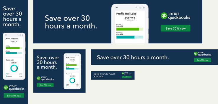
The most commonly used display sizes are:
- 300x250
- 160x600
- 728x90
- 970x250
Depending on platform best practices, other sizes can be requested. For example, Amazon DSP has been seeing high performance on the 160x600.
Note
The logo in product UI screens should be omitted, as it’s already prominently shown in the display design layout.
Buttons
There are 3 main sizes for buttons, each with the appropriate text padding and weight. Buttons also come in 3 different colors, so they can fit various backgrounds.
- The corner radius and padding must be preserved when scaling to avoid a distorted button shape.
- Green buttons are the most important in the button hierarchy, and are always preferred.
- Button copy should always be in sentence case.
Get button assets

Templates
We’ve developed performance media templates (available to download at the bottom of this page). The use of templates is not mandatory. They are meant to help expedite creative executions.
These layouts are standardized but still flexible to address specific use cases:
- Copy, images, and background color are flexible.
- Layouts are fixed.
- Elements can be removed if not needed.
Brand campaigns
Our brand campaigns are thoughtfully themed and designed to educate and entertain. Here’s a sample of some of our most recent work.
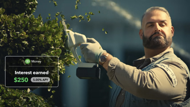
Business Differently
Plant strong financial roots with 5.00% APY and QuickBooks Money.
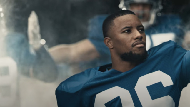
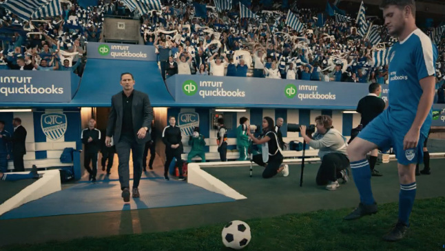
Business Differently
Score big with your finances through QuickBooks Money.

On top of your business
Small businesses owners can feel lighter when they know their finances are under control.

Business Differently
The easy and accurate way to manage payroll and business finances all in one place.
Business Differently
Stay ready with shock-free Self Assessment.

Business Differently
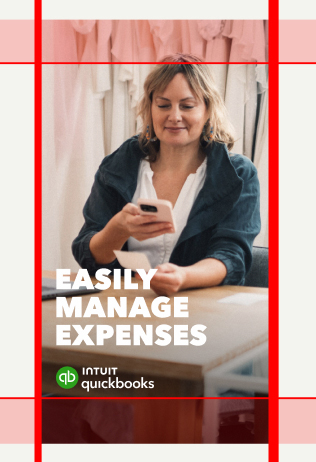
Save time by doing your invoices and expenses as you go.
What not to do
Campaign assets have strict usage guidelines that must be respected.
![]() Don’t use assets beyond their expiration dates.
Don’t use assets beyond their expiration dates.
![]() Don’t use assets outside of their approved geographic location.
Don’t use assets outside of their approved geographic location.
![]() Don’t use assets for non-approved mediums or channels.
Don’t use assets for non-approved mediums or channels.
Available assets

Layout templates for performance

New business? No problem.
Available assets
Performance media templates and toolkit