Crafting unique emails

The right way to attract attention

Gaining a customers' attention is the highest priority for any communication regardless of channel or objective. Can the email be read, understood, and actioned within 11.82 seconds? According to Litmus, this is the average time consumers take to read an email. 


Ensuring our content grabs attention, supports one or multiple objectives, and drives action with a well-placed CTA makes the best use of the 11.82 seconds we have to work with.
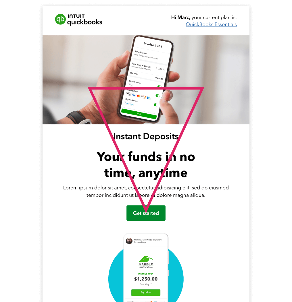
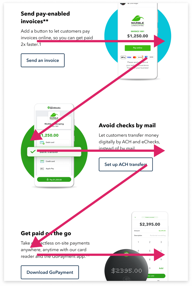
Inverted pyramid of how content should first grab attention, support the message, and drive to CTA

Creative layouts

Within the email guidelines, there are multiple differently designed modules that when stacked together in the right way will gracefully pull your eye down the page. 


There are many different styles of content layout which help achieve this objective; thereby creating harmony throughout the email regardless of how many content elements are in play.

Inverted pyramid

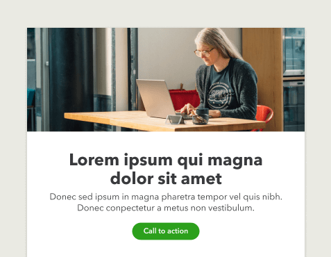
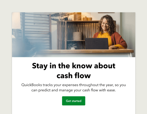
This is the simplest method of laying out content, which directs the reader to a specific CTA. This is normally achieved by leading with an attention grabbing image and/or headline, then supporting copy, and finally, a large CTA.

Example of an email that leads with an image and headline, then supporting copy, and a large button

Module flexibility

The email guidelines have been designed with flexibility in mind, both in terms of how it’s possible to manipulate the individual modules (adjustable image sizes, variable copy lengths, removable elements and customizable colors), and also how we can create different layouts by combining modules together.

Individual module flexibility

It’s possible to manipulate each module to create a variety of looks.

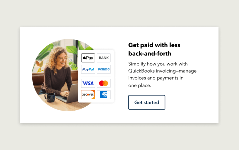
Basic email design system module with an image, badge, headline, body copy and primary button

Basic email design system module.

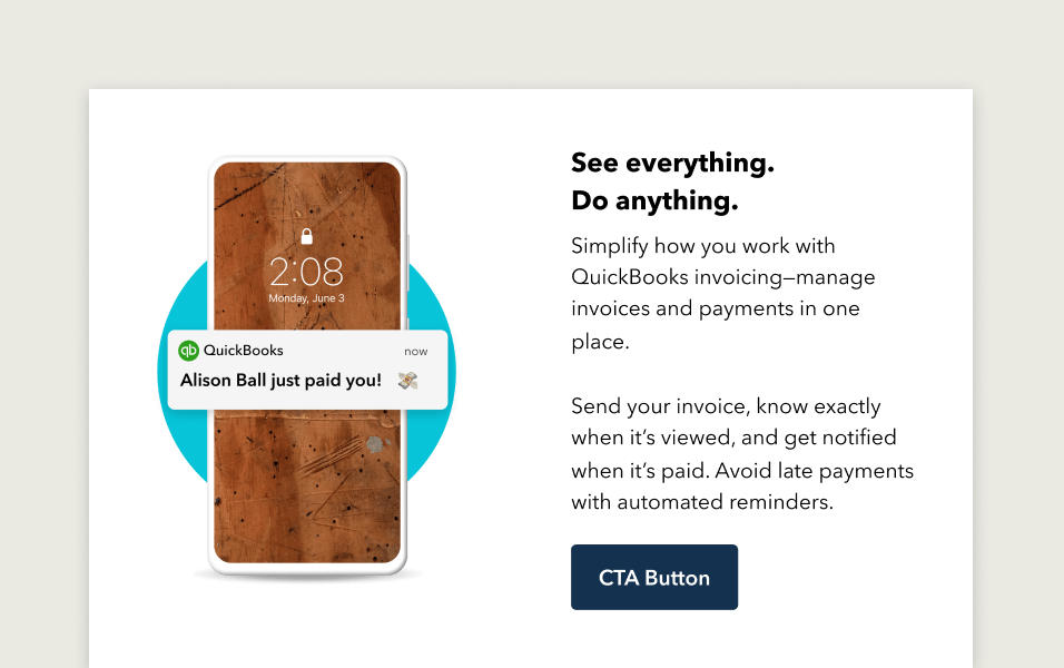
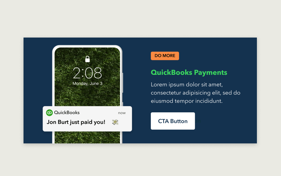
Basic email design system module with an image of a phone, headline, body copy and primary button

Module with image inserted and badge removed.

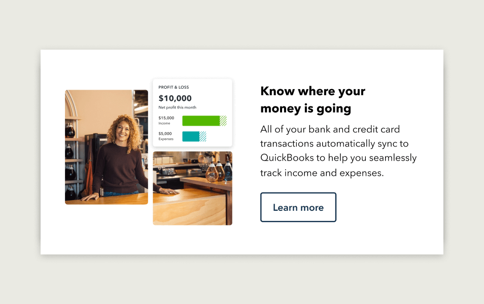
Basic email design system module with multi-framed image, headline, body and primary button

We can create images of any shape to be used in this module.

Basic module with image of a mobile device recieving a text, headline, body copy and primary button

We can change the look of a module with different sized imagery and copy lengths.

Basic email design system module with image, badge, headline, body copy and primary button

We have control over how and where to use color within the modules.

Layout flexibility

The modules of this email guide are built as individual elements; making it easy to use the same modules, but in a different order to create unique layouts.

Example of an email hero module from old design system with image, headline, body copy and button

An example of a fixed layout module from the old email design system.

Example of how an email hero component can be pieced together

The new modules are individual and separate, so they can create multiple layouts.

Example of an email hero module with image, headline, body copy and primary button

We can create a layout very similar to the old fixed module using our new modules.

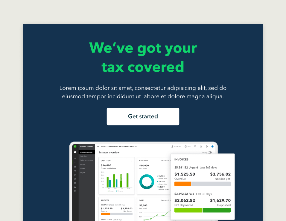
Example of a hero module with image below a headline, body, primary button, and dark background

We can rearrange these same modules and change the colors to create a new layout.

Combining modules

New layouts and designs can be explored by combining different modules, or repeating the same module, in different ways. 

Basic email design system module with image, badge, headline, body copy and secondary button

The modules of the toolkit are designed to be used together to create layouts. 

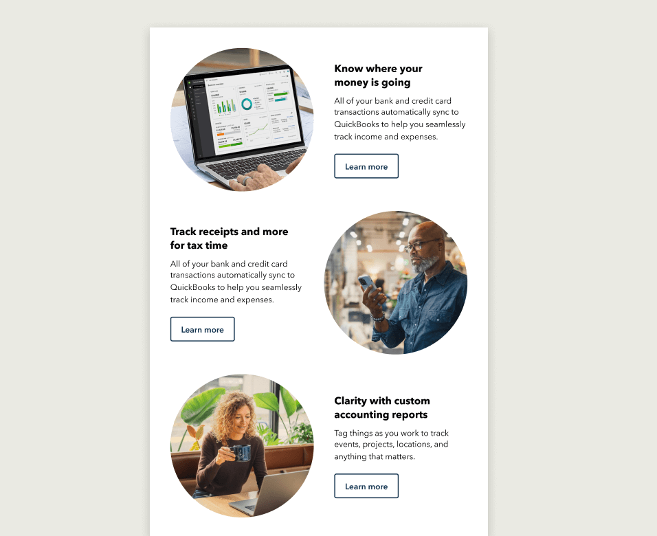
Email design system feature modules stacked in a zig zag layout

It’s possible to create a different layout by combining the module with a different one.

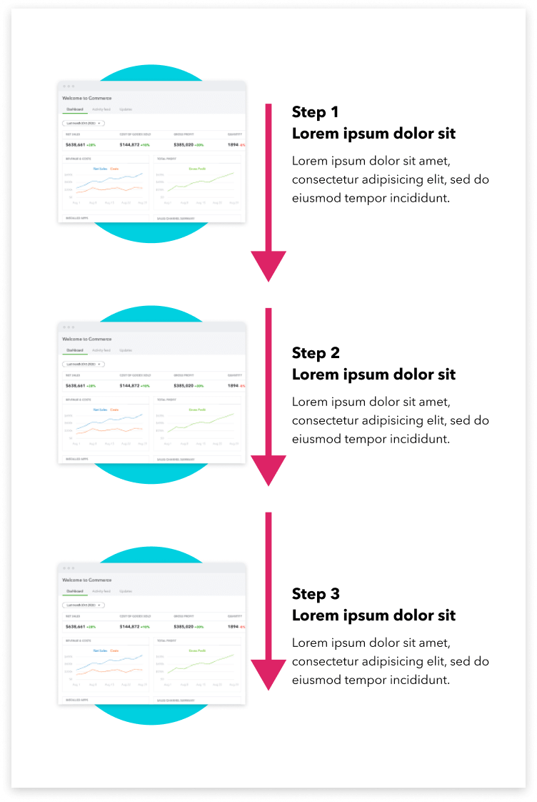
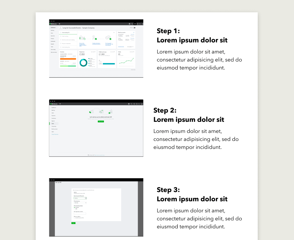
Email design system feature modules in a step-by-step layout style and stacking the modules

A step-by-step style layout created by repeating and stacking the module.

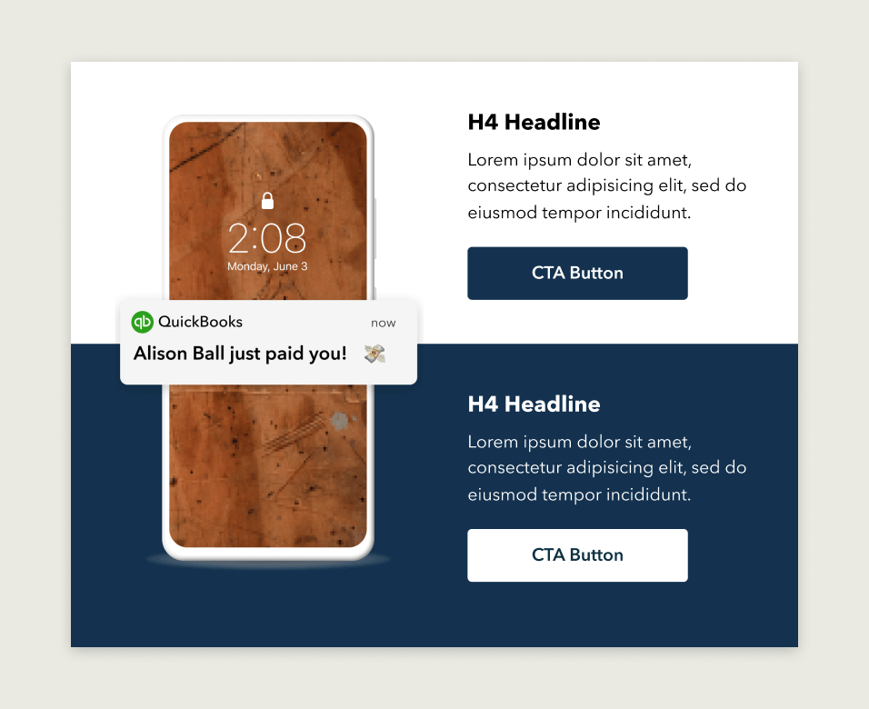
Stacked feature modules integrated together by image of a phone and different colored backgrounds.

It’s possible to create more integrated layouts by playing with colors and imagery.

Disruptive designs

The modules are flexible enough to allow for variation in how they look depending on when they are used. This means if we need an email that stands out a bit more from the rest, we have the scope to do this.

A more disruptive approach to the design of an email will help add emphasis to its message; which can be very useful for things like promotions, feature launches, or Tier A campaigns. Make sure to use disruptive designs cautiously and sparingly, as it’s important to retain a consistent overall brand look by not having every email looking too unique.

A disruptive design (for example: bolder colors, new image techniques, or simplified headers) will stand out more when the majority of emails follow a more consistent approach to their styling.

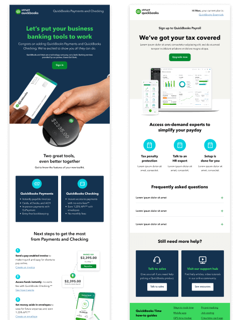
You can see in the example how impactful the darker hero color and bolder image choice is, especially next to the more neutral coloring of a more standard email. However, to maximize this impact when it’s used, it’s important not to overuse this disruptive style.  

Example of a disruptive email next to a neutral email

You can see in the example how impactful the darker hero color and bolder image choice is, especially next to the more neutral coloring of a more standard email. However, to maximize this impact when it’s used, it’s important not to overuse this disruptive style.  

Have work that’s ready for review?

Come to email office hours to make sure it’s brand-approved. Agencies and external partners welcome.