Components

Understanding atomic design: organisms

The term components is used to reference the variety of different modules that you can use to craft your emails; and using the atomic design model helps us think of our email interfaces as both a cohesive whole and a collection of parts. 


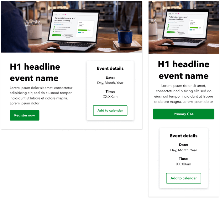
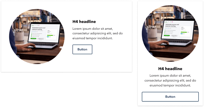
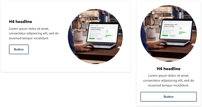
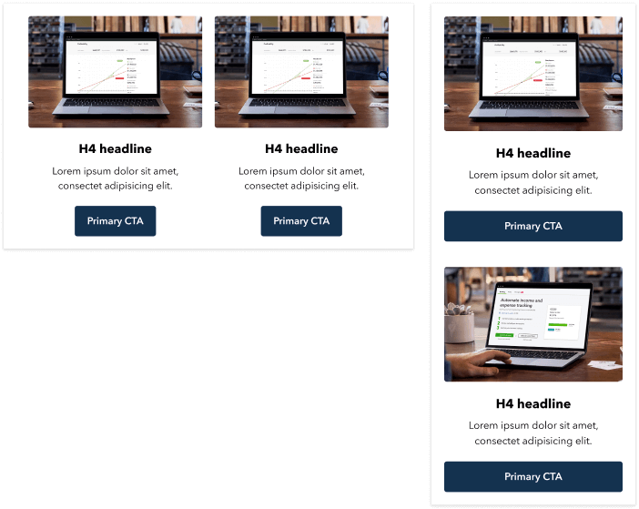
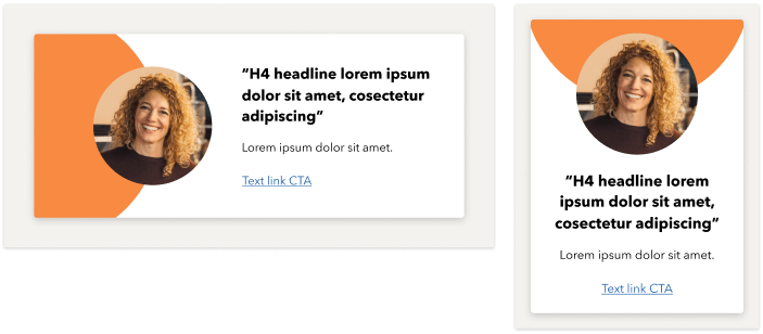
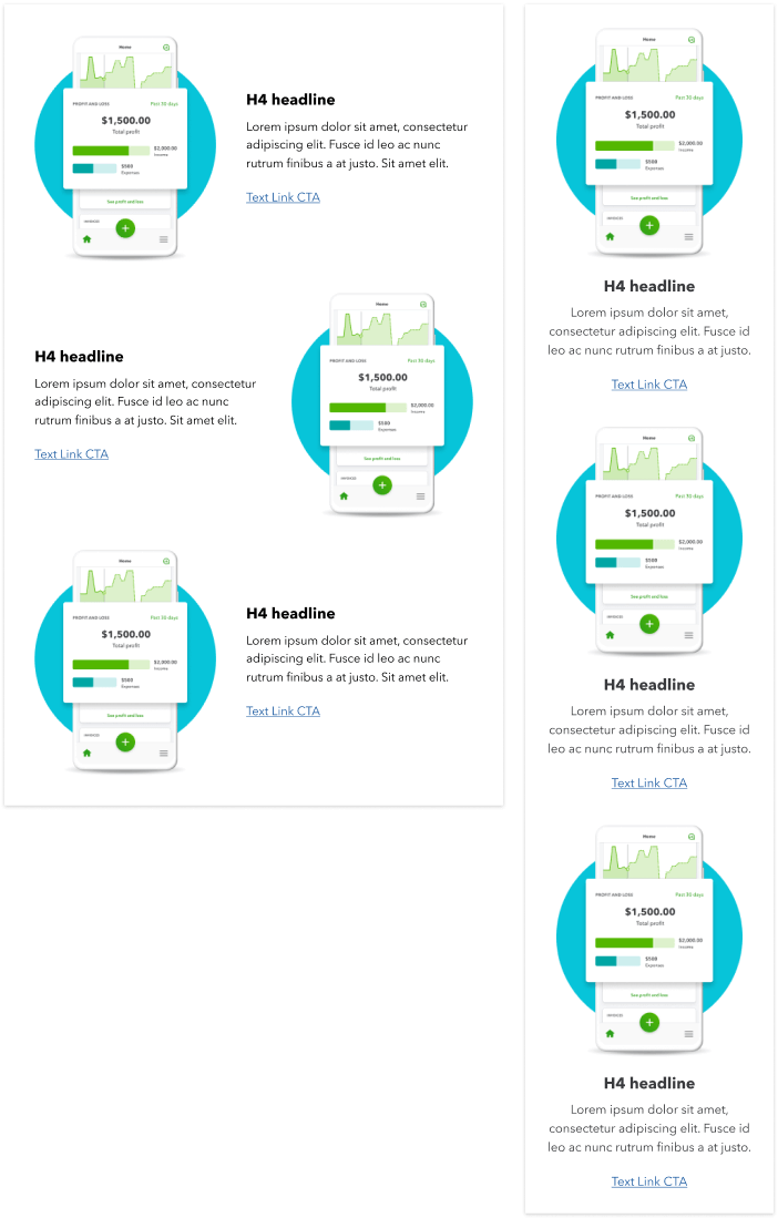
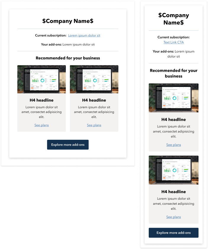
In chemistry, organisms are considered a collection of parts (atoms, or molecules); in design, these are more complex email components made up of a combination of atomic elements. For example: a hero component that’s composed of an image, button, and a text link. The atoms come together to create the more complex organism component. 


Below is a list of all of the available organism components, along with any restrictions regarding their use. 

Header

Header 01: Header with CTA

  • White background
  • CTA: 20 characters max
A desktop and mobile image of an email header with  QuickBooks logo and secondary sign in button

Header 02: Header with text link CTA

Should be used to reduce the number of CTAs at the top of an email, when an email already has prominent CTAs high up in the hero area.

  • White background
  • CTA: 20 characters max
A desktop and mobile image of an email header with QuickBooks logo and sign in link

Header 03: Header with product name

  • White background
  • Badge: 12 characters max
  • Product Name: 32 characters max
A desktop and mobile image of an email header with QuickBooks logo, promo badge, product name

Header 04: Header with personalization

  • White background
  • Personalization uses customer’s first name and the name of their product.
A desktop and mobile image of an email header with QuickBooks logo, personalization and product name

Header 05: Header with navigation

  • White background
  • CTA 20 characters max
  • Navigation has maximum 4 links
  • 12 characters per link
  • Navigation is hidden on mobile
A desktop and mobile image of an email header with QuickBooks logo, sign in, and navigation links

Header 06: Header on alternative background color

  • Background color is editable
  • CTA: 20 characters max
A desktop and mobile image of an email header with blue background, QuickBooks logo and sign in

Header 07: Accountant header

  • Dark grey background
  • Product name is fixed
A desktop and mobile image of an email header with QuickBooks logo and Accountant product call-out

Hero

Hero 01: One-column primary

A one-column module that includes a H1 headline. Must be used in the primary position in an email. Displays a different image on mobile. Content stacks into a single column on mobile.


  • Desktop image size: 1320x480
  • H1 headline: 2 lines (50 characters max)
  • Body copy: 95 characters max
  • CTA text: 25 characters max
  • Refer to color guidelines for background color options
A desktop and mobile image of a hero component with image, headline, body copy, primary button

Hero 02: One-column primary - Image below

A one-column module that includes a H1 headline. Must be used in the primary position in an email. Image stacks below content and button. Displays a different image on mobile. Content stacks into a single column on mobile.


  • Desktop image size: 1320x480
  • H1 headline: 2 lines (50 characters max)
  • Body copy: 95 characters max
  • Refer to color guidelines for background color options
A desktop and mobile image of a hero component with image below, headline, body copy, primary button

Hero 03: Two-column primary

A two-column module that includes a H1 headline. Must be used in the primary position in an email. Displays a different image on mobile. Content stacks into a single column on mobile.


  • Desktop image size: 640x760
  • H1 headline: 20 characters max
  • Body copy: 85 characters max
  • CTA text: 25 characters max
A desktop and mobile image of 2 column hero component with headline, body copy, and primary button

Hero 04: Event primary

A primary module with image, headline, CTA, and space for event details. Must be used in the primary position in an email. Displays a different image on mobile. Content stacks into a single column on mobile.


  • Must only be used to announce an event.
  • Desktop image size: 1320x480
  • H1 Headline: 20 characters max
  • Body copy: 85 characters max
  • CTA text: 25 characters max
  • Event details: Space for date and time.
A desktop and mobile image of hero component used to promote an event

Hero 05: Critical communications hero

This module is only used to highlight a priority message. The icon at the top should reflect the subject of the email and be colored according to the priority level.


  • Icon Size: 144x144
  • H1 Headline: 50 characters max
  • Body copy: Optional. 85 characters max
  • CTA text: Optional. 25 characters max


Only the following icons can be used in this module. Remember to pay close attention to when they should be used. 


Red icon - To be used when a message is critical.


Yellow icon - To be used when attention is needed.


Blue icon - To be used for informational messages.

A desktop and mobile image of a critical comms hero with critical red icon
A desktop and mobile image of a critical comms hero with needs attention yellow icon
A desktop and mobile image of a 2 column feature email component with image on left

Feature

Feature 01: Two-column image left

A two-column component with an image on the left. Displays a different image on mobile. Content stacks into a single column on mobile. Shown are the various component variants to work with.


  • Desktop image size: 560x600
  • Badge: Optional. 2 words max
  • H4 headline: Optional. 40 characters max
  • Body copy: Optional. 75 characters max
  • CTA text: Optional. 25 characters max
  • Spotlight: Optional. Use Agave-50 or Kiwi-50 for color.
A desktop and mobile image of a 2 column feature email component with image on left

Feature 02: Two-column image right

A two-column component with an image on the right. Displays a different image on mobile. Content stacks into a single column on mobile.


  • Desktop image size: 560x600
  • Badge: Optional. 2 words max
  • H4 headline: Optional. 40 characters max
  • Body copy: Optional. 75 characters max
  • CTA text: Optional. 25 characters max
A desktop and mobile image of a 2 column feature email component with image on right

Feature 03: Two-columns

A two-column component with each column having an image, headline, copy, and CTA. Desktop image is resized for mobile.


Per column:

  • Desktop image size: 560x 360
  • H4 headline: Optional. 40 characters max
  • Body copy: Optional. 55 characters max
  • CTA text: Optional. 25 characters max
A desktop and mobile screenshot of a 2 column feature email component

Feature 04: Three-columns

A three-column component with each column having an image, headline, copy, and text link CTA. Desktop image will maintain its size on mobile.


Per column:

  • Desktop image size: 360x240
  • H4 headline: Optional. 20 characters max
  • Body copy: Optional. 50 characters max
  • CTA text: Optional. 4 words max
A desktop and mobile screenshot of a 3 column feature email component

CTA Block

There are different types of CTAs throughout the email design system. Remember to please pay close attention to their color rules.

A desktop and mobile image of a cta block with side by side primary and secondary buttons
A desktop and mobile image of a cta block with side by side primary button and text link
A desktop and mobile image of a cta block with stacked primary button and text link
A desktop and mobile image of a cta block with side by side primary button and video link
A desktop and mobile image of a cta block with stacked primary button and video link
A desktop and mobile image of a cta block with side by side primary button and phone number
A desktop and mobile image of a cta block with stacked primary button and phone number

Card

Cards 01 - Full width highlight box

A full width module with content sitting in a colored box. Used to give emphasis to a particular message. Background colors are editable, but follow the color guidance on the ‘Accessibility’ page.


  • Badge: Optional
  • H3 headline: Optional. 55 characters max
  • Body copy: Optional. 85 characters max
  • CTA text: Optional. 25 characters max
  • Elevation: Optional
A desktop and mobile image of a full width email component used to provide message emphasis

Cards 02 - Highlight box with image

A full width module with content sitting in a colored box, including an image. Used to give emphasis to a particular message. Background colors are editable, but follow the color guidance on the ‘Accessibility’ page.


  • Image: 480x560
  • H4 headline: 40 characters max
  • Body copy: 85 characters max
  • CTA text: 25 characters max
highlight-box-with-image-box-cards-02-component-email

Cards 03 - Two-column highlight boxes

A 2 column module with content sitting in colored boxes. Used to give emphasis to particular messages. Background colors are editable, but follow the color guidance on the ‘Accessibility’ page.


Per column:

  • Image: Optional.144x144
  • H4 headline: Optional. 40 characters max
  • Body copy: Optional. 45 characters max
  • CTA text: Optional. 25 characters max
A desktop and mobile image of 2 column email component used to provide message emphasis

Cards 04: Two-column articles

Two-column layout used to highlight new articles. The badge text and color is fixed.


Per column:

  • Image size: 560x320
  • H4 headline: 40 characters max
  • Body copy: Suggest 45 words max
  • Text link: 25 characters max
  • Elevation: Optional
A desktop and mobile image of a two-column layout used to highlight new articles

Icon & text grid

Icon and text grid 01 - 2 column

A two-column module designed to hold an icon on the left, with a headline, line of copy, and text link on the right. Desktop image is shown on mobile.


  • Image: 144x144
  • H4 headline: Optional. 35 characters max
  • Body copy: Optional. 95 characters max
  • Text link: Optional. 25 characters max
A desktop and mobile image of a 2 column component with icon, headline, copy, text link

Icon and text grid 02 - 3 column

A three-column module designed to hold an icon, headline, line of copy, and text link. Desktop image is shown on mobile.


  • Image: 144x144
  • H4 headline: Optional. 10 characters max
  • Body copy: Optional. 50 characters max
  • Text link: Optional. 15 characters max
A desktop and mobile image of a 3 column component with icon, headline, copy, text link

Accordion

Accordion 01

A click-to-expand menu that allows the user to click to show more content on demand.  


  • Item title: 40 characters max
  • Item text: 95 characters max
A desktop and mobile image of a click-to-expand menu

Comparison Table

Comparison table 01

Used to show the features of a package, and compare two packages. If a feature does not exist in the comparison, leave the field blank. Number of lines is flexible, minimum 3 lines and a maximum of 8 lines.


  • Column header: 20 characters max
  • Line item: 40 characters max
  • Tick icon: 32x32
  • Column CTA: 10 characters max
A desktop and mobile image of an email comparison table component

Link library

Link library 01

Collection of text links, with chevron CTAs. Number of links is flexible, with a minimum of 3 links, and maximum of 8 links.


Per row:

  • Text link: 55 characters max
A desktop and mobile image of a collection of text links with chevron call-to-actions

Testimonial

Testimonial 01

Used to highlight a particular testimonial. Image needs to be placed into the circular holder before being exported with the orange semi-circle background behind it.


  • Image size: 320x320
  • H4 headline: 75 characters max
  • Name of quoter: 40 characters max
  • Text link: 20 characters max
A desktop and mobile image of an testamonial component used to highlight a particular testimonial

Carousel

Carousel 01

A click-to-scroll carousel that allows the user to click to view the next content on demand. Number of items is flexible, with a minimum of 3 items and a maximum of 5 items.


Per item: 

  • Image: 480x500
  • H4 headline: 25 characters max
  • Body copy: 75 characters max
  • Text link: 15 characters max
  • Spotlight: Optional. Use Agave-50 or Kiwi-50 for color
A desktop and mobile image of a click-to-scroll carousel

Fallback

To be displayed where interactive content isn’t supported.

A desktop and mobile image of fallback display of email carousel component

Personalization

Personalization 01 - Know me, long

Used to recognize a customer and offer them personalized content based on their business or subscription.


  • H3 headline (Company Name): 25 characters max
  • H4 headline: 45 characters max
  • Card headline: 15 characters max
  • Card copy: 45 characters max
  • Card text link: 25 characters max
  • CTA text: 25 characters max
A desktop and mobile image of a personalization email component with customer and relevant info

Personalization 02 - Know me, short

Used to recognize a customer and let them easily sign in to their account.


  • Icon Size: 144x144
  • H4 headline (Company Name): 25 characters max
  • CTA text: 25 characters max
A desktop and mobile image of a personalization email component with customer info

Personalization 03 - My view

Easy-to-access links personalized to a customer’s business and subscription.


  • H4 headline (Company Name): 40 characters max
  • Icon size: 144x144px
  • Text links: 40 characters max
  • Body copy: 40 characters max
  • CTA text: 25 characters max
A desktop and mobile image of a personalization email component with easy to access links

Personalization 04 - What’s next

Used to recognize where a customer is in their set up journey.


  • H4 headline (Company Name): 30 characters max
  • Image size (on desktop): 360x496
  • Image size (on mobile): 560x300
  • Icon size: 128px x 128px
  • Text links: 15 characters max
A desktop and mobile image of a component used to recognize where a customer is in their set up

Personalization 05 - Celebrate me

Used to recognize and celebrate a customer’s subscription anniversary.


  • Icon size: 144x144
  • H4 headline (Company Name): 35 characters max
  • Body copy: 75 characters max
A desktop and mobile image of an email  component used to celebrate a customer’s anniversary

Personalization 06 - Onboarding journey

Used to display the steps a customer needs to complete when they join QuickBooks. The highlighted step represents the step where they are currently. Content will be centered within module. 


  • Number of Steps: Mimimum of 3. Maximum of 4
  • Icon: 128x128
  • Step name: 15 characters max
A desktop and mobile image of a component used to display the steps a customer needs to complete

Rating & Review

Rating and Review 01

Used to highlight a single review with star rating.


  • H4 headline: 70 characters max
  • Copy: Optional. 120 characters max
  • Star icon: 32x32
A desktop and mobile screenshot of a component used to highlight a single review with star rating

Tip

Tip of the week 01

Used to highlight a quick tip with a text link to find out more.


  • Icon size: 144x144
  • H4 headline: 30 characters max
  • Body copy: 75 characters max
  • Text link: 20 characters max
A desktop and mobile image of a component to highlight a quick tip with a text link to learn more

Countdown

Countdown clock 01

Used to add urgency to a particular message or promotion. This module is only available when using Moveable Ink.


  • H4 headline: 20 words max
A desktop and mobile image of an email component to add urgency with a headline and countdown clock

Promo banner

Promo banner 01

A slim banner with CTA, used to highlight a short message.


  • H4 headline: 30 characters max
  • CTA text: Optional. 20 characters max
A desktop and mobile image of an email promo banner with a headline and call-to-action button

Footer

Footer 01 - Personalized links

These links should be tailored to the message of the email they are included in.


  • Green background.
  • Title: 30 characters max
  • 6 links, 20 characters per link max
A desktop and mobile image of a footer component with links to various QuickBooks how-to guides

Footer 02 - Navigation

Interactive drop-down navigation is used to direct users to specific areas of the website. Fallback states are as shown below.


  • Dark grey background
  • 3 sections, 3 links per section
  • Section title is 15 characters max
  • Each link is 24 characters max
A desktop and mobile image of component to learn more about products, resources, and contact info

Footer 03 - App push

This module should be included in emails where a visual push to download the app is required.


  • Headline: 30 characters max
A desktop and mobile image of a component to download the app to manage QuickBooks on the go

Footer 04 - Legal text

This module should be used at the bottom of every email created. Includes all legal text and company logos.

A desktop and mobile image of a component containing legal disclaimers, links, and Intuit logos

Have work that’s ready for review?

Come to email office hours to make sure it’s brand-approved. Agencies and external partners welcome.