We use video content to tell stories about business owners, their teams, and our products. Video creation guidelines are different based on the subject or the placement of the video.
Video
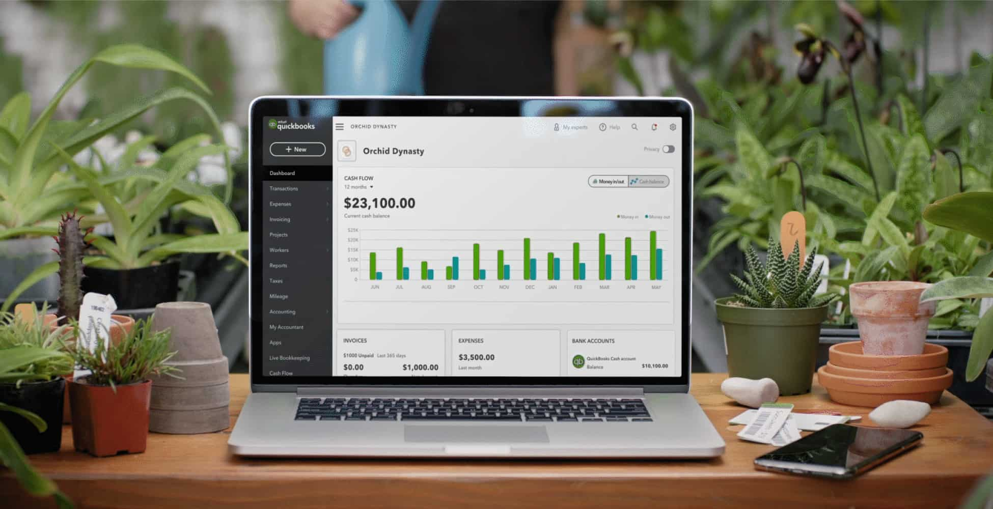
Video
We use video content to tell stories about business owners, their teams, and our products. Video creation guidelines are different based on the subject or the placement of the video.

The basics
QuickBooks videos can be used for social, web, TV, events, educational purposes, and more. Most videos fall into one of the 6 groups below.
Brand campaign
Top-of-funnel brand and awareness-focused films where product plays a supporting role in the overarching message.
Product campaign
Top-of-funnel, brand-forward films with product focus.
Customer testimonial
Focused on customer stories, their businesses, and how QuickBooks fits in.
Product explainer
Showcases both emotional and functional benefits of the product, with a distinct brand impression. It may not feature a real small business.
Product launcher
Focused on innovations and product launches. Showcases both emotional and functional benefits of the product.
Product tutorial
Provides a step-by-step guide on how to use the product. It shows product only.
Customer videos
If the video is customer-focused, QuickBooks is not the main subject of the story. Cinematography, music, editing, minimal design, and motion graphics drive brand resonance while keeping the focus on people.

Lighting
Create rich and honest frames that highlight people and spotlight our customer, while edge lights enhance the space around them. This helps capture the feeling of single-source lighting.

Shot composition
Frame interview and action shots using golden composition, favoring the center of frame, to keep the story and action in the viewer’s line of sight. Use subtle and organic movement.
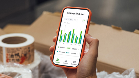
Interaction with product
Our preferred product representation is on a device. Shoot clean device plates for 45 seconds to allow enough time for product motion to be added in post.
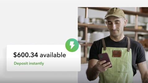
Juxtaposed with product
Product components can be pulled out or juxtaposed next to the customer.
Product videos
Product-focused videos show benefits and provide step-by-step guidance for our customers. Our marketing videos build confidence, while demos and tutorials drive ongoing use.
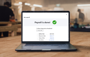
Comp product screens into devices in the hands (or in front) of customers, using footage from customer story videos.
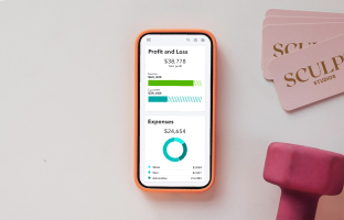
Comp product screens into devices in environment, using camera movements and close-ups to carry the story forward.
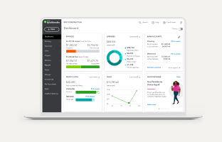
Show the product inside illustrated devices or browser containers over the neutral background.

When showing customers interacting with our product, open on a customer to establish the scene and spend 80% of the video focused on the product. Comp product screen into the device.
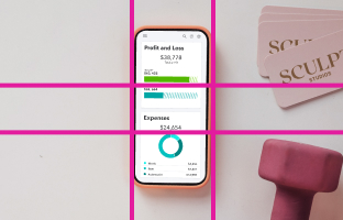
Compose in central framing, making it easy for the viewer to follow the action and understand the functionality and benefits of the product. Use close-ups to emphasize product moments.
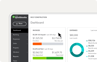
Browser or mobile interactions should be shown using close-ups. Use animated cursor for browser if needed.
On-screen graphics
On-screen graphics should be minimal and clean, so the focus remains on our customers or products. Use titles, inlays, and lower thirds to enhance the story. Graphics may enter and exit the frame based on defined motion patterns.
Title cards
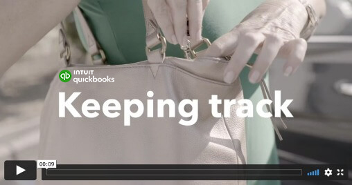
Use clean text over b-roll footage to accurately reflect the subject matter based on video type. Padding between logo and title is 40px. Not all videos require a title card.
Text: White or Pepper-120 (#21262A) in Bold 152/156, sentence case.
Motion: entrance at 0.00, 0.00, 0.20, 1.00, exit at 0.80, 0.00, 1.00, 1.00
End cards
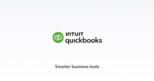
We use the preferred QuickBooks lockup in our video end card. This is a fixed element with flexible variants for specific use cases. The lockup serves as an impactful ending with durable brand resonance designed to land directly in the viewer’s eye line at the end of a video. The location of the message is fixed, but the message text is flexible.
Lower thirds
Used to identify a customer, the name of their business, profession, or a social media account.
Text: Bold 60px font (line 1), and Regular 40px font (line 2). Line spacing 30px.
Color: White or Pepper-120 (#21262A).
Padding: horizontal (250px) and vertical (125px).
Motion: 0.00, 0.00, 0.20, 1.00 (entrance), and 0.80, 0.00, 1.00, 1.00 (exit).

Inlays and interstitials
Text inlays and interstitials add important info to a specific shot of a customer. Bold words or phrases help emphasize key details.
Text: Regular 44/52 px font, Bold for emphasis, in sentence case. 30-50 characters (recommended). Color: White or Pepper-120 (#21262A).
Motion: 0.00, 0.00, 0.20, 1.00 (entrance), and 0.80, 0.00, 1.00, 1.00 (exit).

Voice & tone
Video scripts should be written in our QuickBooks voice and tone, and reflect our 3 voice attributes: warm, confident, and genuine. Below, you’ll find some tips on how to write effective scripts.
Design for your call to action
Define the action you want your audience to take after viewing the video. Ideally, your content encourages viewers to sign up, use a feature, download our app, etc. CTAs should appear as on-screen text adhering to interstitial title design guidelines.
Answer one question
Communicate the main idea to your audience. Get specific about the takeaway, whether it’s task completion, feature capability, or how QuickBooks fits into their lives.
Brevity goes a long way
Keep your script as short as possible. If it feels like you’re squeezing in too many ideas, instructions, or benefits, you probably are. Consider creating another video that picks up where this one leaves off.
Writing product video scripts
The QuickBooks video voice is a proactive champion. We speak directly to the viewer in an aspirational but relatable way. We write our scripts the way people speak—with common contractions and no filler words. We never make assumptions about the viewer.
- Write in active voice.
- Favor simple tenses.
- Be precise and definitive.
- Use everyday contractions.
- Write conversationally. For example, it’s OK to end sentences with prepositions.
Don’t overuse exclamations.
Don’t ask rhetorical questions.
Don’t include fillers (uh, ah, um), unnecessary pauses, or slang.
Don’t make assumptions or speak for the viewer.
Don’t get specific in ways that could alienate the viewer.
Titles, inlays, and interstitials
Titles should accurately reflect the content of the video—the customer story, product feature, or benefits. If the copy is placed over an image, make sure both copy and image complement or tie into one another. Prioritize clarity over cleverness.
- Use inlays and interstitials to introduce important information not covered in the storyline.
- Be brief, be clear, and create resonance.
- Expand upon the passion, person, product, service, or overall business.
- Use bold words or phrases to emphasize key details, but don’t overdo it.
Don’t place text and product UI on screen at the same time. These two elements often compete for audience attention.
Line 1: Include the customer’s full name in the first line.
Line 2A: Small business owners, founders, or corporate executives should have their title included along with the name of the business in the second line. The same applies for accounting firms.
- Don’t include titles for other employees.
- Self-employed individuals should be identified based on their craft or profession.
Don’t include a business name or qualifier like “freelance.”
Line 2B: If transitioning to a social media handle, use either Instagram or Twitter.
Don’t include the “@” symbol.
Keep it human. Even if it means breaking grammar rules, voiceover copy should sound like we talk, using our voice and tone guidelines. Use short sentences and phrases. Keep it warm. Be a champion.
When creating a voiceover, cast your voice talent based on the following criteria:
- Age: 30-50
- Tone: Passionate but conversational. Not salesy.
- Pacing: Slow enough to guide but not so much that we belabor the point.
- Delivery: Voiceover should sound colloquial—the way people actually talk, not the way they write. This might mean breaking minor grammar rules or speaking in phrases instead of sentences.
Avoid using words like tap, touch, push, press, click, swipe, or hit. Avoid describing a location-based interaction—right, left, up, down, etc.
Captions and transcripts
Use a preferred vendor to provide human-generated timecode captions. Upload to a caption-enabled platform like YouTube or Facebook.
Provide a transcript for every video. It allows viewers to read at their own pace, especially if it’s a tutorial video. Use words like select, enter, or choose. Find opportunities to give instructions like “save your work” instead of “tap save.”
What not to do
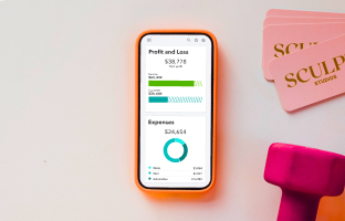
Don’t use accessories (like a phone case) that are visually distracting.
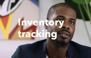
Don’t put graphics over customer faces or shots where the customer is the focus.

Don’t use dark emotional lighting without purpose or over-light the scene to create flat-looking shots.
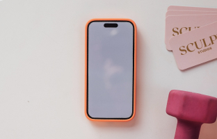
Don’t shoot QuickBooks product on a device on set. The screen should be comped in post.
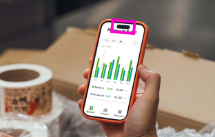
Don’t show inaccurate or altered product screens inside of real, recognizable, name-brand devices.

Don’t add text or other design elements on top of product visuals.
Downloadable assets
Here are the assets you’ll need to get started.

Have work that’s ready for review?
Come to design and content office hours to make sure it’s brand-approved. Agencies and external partners welcome.
© 2025 Intuit Inc. All rights reserved.
Intuit, QuickBooks, QB, TurboTax, Mint, Credit Karma, and Mailchimp are registered trademarks of Intuit Inc. Terms and conditions, features, support, pricing, and service options subject to change without notice.
By accessing and using this page you agree to the Terms and Conditions.