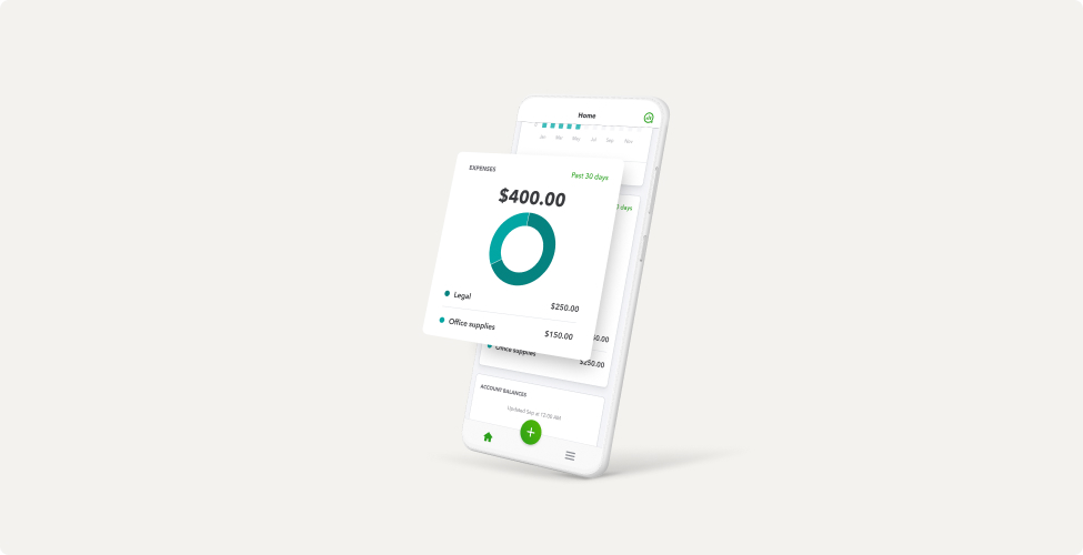
Product expression visually enhances content about QuickBooks functionality. When showing our product, focus on one element at a time, ensuring that each point of focus flows naturally to the next.
Product expression
The basics
Devices
We’ve created a family of stylized vector devices to use across marketing channels as needed.
We only use white stylized devices.
Mobile and laptop as a pair should be reserved for cross-device reference only.
Product UI screens
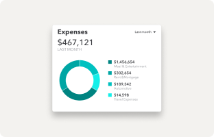
Extracted product UI detail
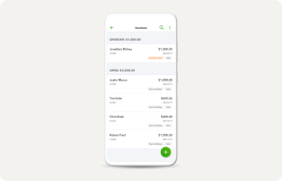
Product UI on device
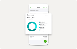
Product UI on device with pop-up
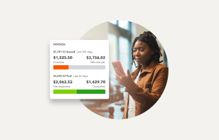
Extracted product UI pop-up over photography
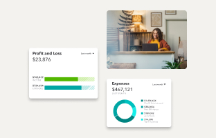
Combination of extracted product UI and photography tiles
Before using any product screens, make sure that:
- All numbers, values, and dates are accurate and relevant to the use case
- Names of people and businesses are taken from our Name In Lights program, which is a comprehensive, up-to-date list of all approved names we’re allowed to use. If you need access to Name in Lights for your project, please ask your QuickBooks design partner.
- If combining the product screen with brand photography, use the name of the business featured in the image, if applicable.
- Extracted product UI and image pairs should reflect the same device (for example, both are from a desktop product).
Adding product UI screens to devices
Fitting our product UI screens into various devices properly may require some adjustments.
Mobile status bar
Keep the status bar at the top of a mobile screen in lifestyle photography or videos.
Remove the status bar if product UI is shown in a vector device.
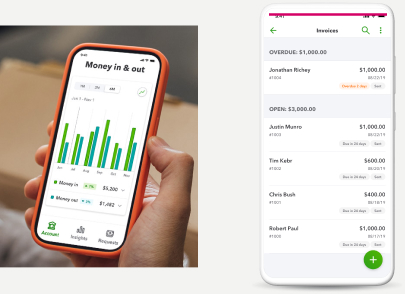
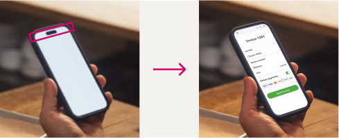
Speaker notch
If the lifestyle photography includes a device that has a notch at the top, cover it with the product UI.
Scaling & masking
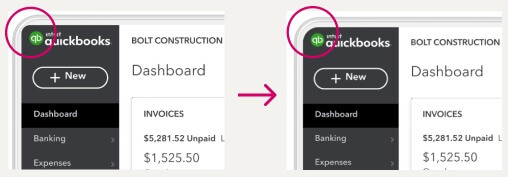
Scaling in Figma can sometimes ruin the corner radius of the mask. Use the scale tool for more accurate scaling.
Photography and product UI
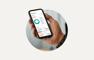
Image crop can have a device partially breaking the edge.
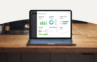
For full-bleed photography, crop a curve at the top edge, with a device breaking the edge.
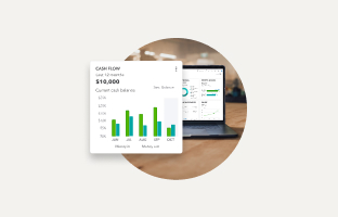
Only use one pop-up UI when placing it over an image or a full screen UI.
Product spotlight
We sometimes use a circle shape as a vibrant graphical element to draw additional attention to our product.
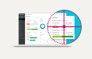
If a pop-up and a full UI screen are used together, spotlight the pop-up.
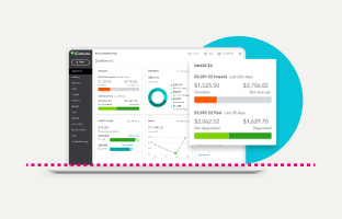
If a laptop image shows a pop-up, the color spotlight should be placed above the keyboard.
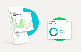
Only use Kiwi-50 or Agave-50 for the circle spotlight background element.
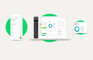
If there is a stand-alone device or a stand-alone pop-up, center-align the circle behind it.
Drop shadow
Drop shadow and elevation also help with product focus by adding dimensionality and visual dynamic.
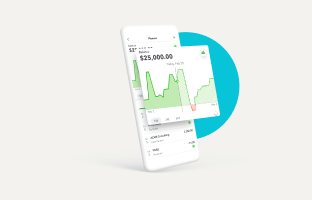
If the device is shown at an angle, the pop-up’s drop shadow should be only on the device.
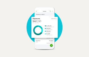
With all frontal views, the shadow should be on the device and the background, too.
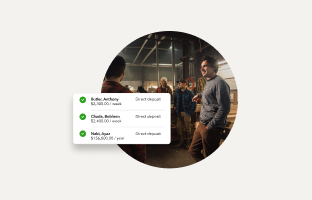
Photography or video thumbnails don’t have a drop shadow, but the pop-up does.
What not to do
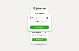
If using a pop-up over a device, don’t duplicate what’s already shown on a device (unless it’s illegible).
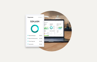
Don’t combine a pop-up and a device from different platforms (for example, mobile vs desktop).
Don’t change the color of the stylized device.
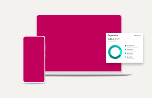
Don’t include a product UI pop-up when showing more than one device.
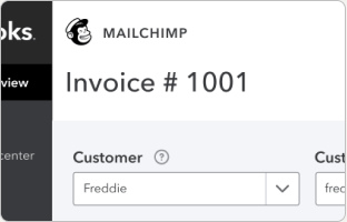
Don’t use logos, names of people, or business names without legal approval.
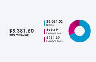
Don’t use mathematically inaccurate data and graphs.
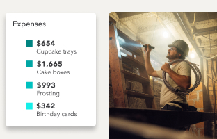
Don’t pair non-relevant data and images.
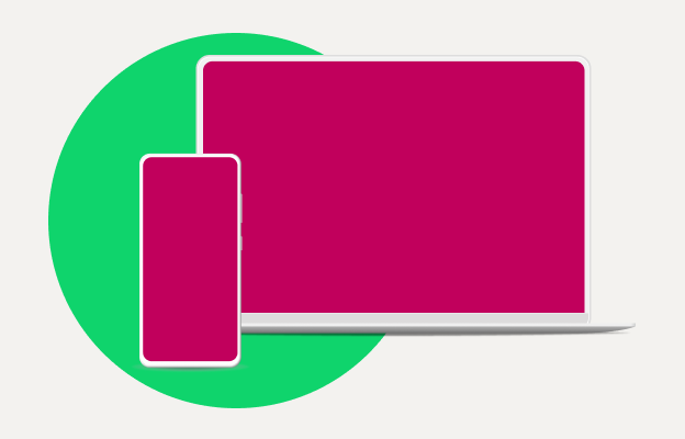
Don’t include a spotlight element when showing more than one device.
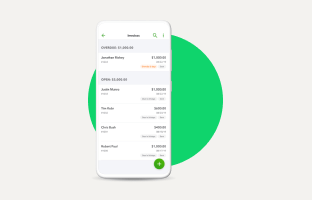
Don’t use a spotlight off-center.
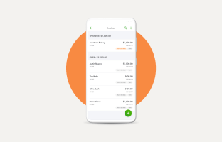
Don’t use non-approved spotlight colors.
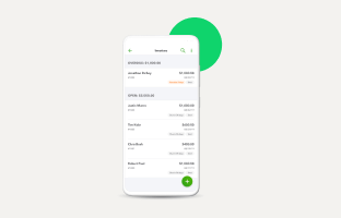
Don’t use spotlights as decorative elements.
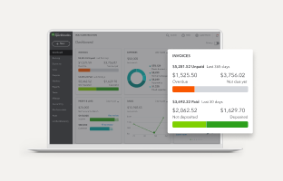
Don’t add overlays to the screen behind the extracted UI pop-up.
Available libraries
Here are the assets you’ll need to get started.
Have work that’s ready for review?
Come to design and content office hours to make sure it’s brand-approved. Agencies and external partners welcome.
© 2025 Intuit Inc. All rights reserved.
Intuit, QuickBooks, QB, TurboTax, Mint, Credit Karma, and Mailchimp are registered trademarks of Intuit Inc. Terms and conditions, features, support, pricing, and service options subject to change without notice.
By accessing and using this page you agree to the Terms and Conditions.