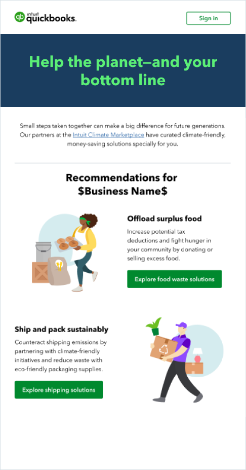
We use lifestyle illustration to highlight customer stories where QuickBooks has made an impact. Illustration is more than just decorative—it can take a complex idea and make it easier to understand. It allows us to showcase our product in a way that feels human and fun.
Illustration
Guiding principles
Story
Illustrations tell customer stories by depicting their craft and aspirations through thoughtfully conveyed ideas. They should never be used just for decoration.
Emotion
Active, organic, and approachable illustrations drive emotion and create connections. They represent more than just customer journeys—they also represent the QuickBooks brand.
Presence
Illustrations guide users and help communicate important messages. Use them sparingly to provide clarity and context without taking away from the message.
Character set
Our character illustrations represent our diverse customers and their industries. Each character illustration has its own personality, conveyed by physical features, outfits, and accessories.
The illustrations shown here are just some of the characters available. You can access the full set of characters from the One Intuit Digital Asset Management (OIDAM) system, or request an illustration.
The basics
Diversity
Diversity is a cornerstone of the QuickBooks brand. We’ve added specific colors to our brand palette to represent the range of diversity in skin tones and hair colors.
Cropping
Cropping is allowed when there are spacing constraints. Use the spotlight to crop and frame an illustration.
To preserve the integrity of the original illustrations, we allow cropping, but not scaling.
Mix and match
Our characters can be customized with different skin tones, hairstyles, clothing, accessories, physical abilities, poses, background scenes, and spotlight colors.

Color palette
We use the full Intuit color palette in our lifestyle illustrations.
Background scenes and spotlight usage
- Spotlight behind the character is optional and should be used to create contrast with the background when necessary. It is not mandatory for every illustration.
- Light and dark mode spotlights have appropriate color values that allow them to recede into the background. Ice-110 should be used on white backgrounds, Kale-110 should be used for dark mode.
- Details (ie. lamp, sticky notes) can be added to the spotlight to provide more context to the environment of the illustration, but they should be monochromatic. This is so we can prevent visual clutter and maintain clarity for the primary subject in the foreground. Details are also optional.
Spot illustrations
Spot illustrations provide clarity and context, and are used for marketing purposes only. They help establish visual hierarchy by highlighting features and benefits.
Our feature & benefit spot illustrations come in 2 color options, Kiwi and Agave. Our preferred color choice is Agave. Certain countries use Kiwi as their preferred color for market fit reasons. Make sure to check with your local design lead for color guidance. All illustrations sit inside a 76px by 76px circle container.
Don’t use both colors. Stick to the one color that’s specific to your geographic region.
Don’t use illustrations out of the circle container. Use the original size of each illustration in order to maintain line weight.
Don’t use in combination with Lifestyle illustrations.
Don’t use as a clickable element.
Industry illustrations are used to represent different industry types. All illustrations are created in a 36px by 36px grid.
Don’t place industry illustrations inside of a circle container.
Don’t scale illustrations. Use the original size of each illustration in order to maintain line weight.
Don’t use as a clickable element.
Exceptions
Marketing and product usage
Lifestyle illustrations are used as storytelling elements, primarily for marketing and product. In-product lifestyle illustrations can be used for first-time use cases, non-filtered results or zero states, and in-product discovery.
All illustrations should capture the overall theme of the content. Use them sparingly to provide clarity and context to enhance the message.


What not to do

Don't use photos with illustrations.

Don't use illustrations to represent live experts.

Don't combine illustration with video thumbnails and product UI.
Don't include text or numbers with illustration.

Don't change spotlight colors. Use approved spotlight colors only.
Don’t mix and match different illustration styles. Be mindful of context and usage.
Don't use objects by themselves (without people) to tell a story.
Don't randomly mix and match characters and items. Ensure characters and scenes work together to tell a cohesive story.
Don't put illustrations on strong color backgrounds.
Available libraries
Here are the illustration libraries with the assets and guidelines you’ll need to get started. Can't find what you need? Request a new illustration.
Spot illustrations
Have work that’s ready for review?
Come to design and content office hours to make sure it’s brand-approved. Agencies and external partners welcome.
© 2025 Intuit Inc. All rights reserved.
Intuit, QuickBooks, QB, TurboTax, Mint, Credit Karma, and Mailchimp are registered trademarks of Intuit Inc. Terms and conditions, features, support, pricing, and service options subject to change without notice.
By accessing and using this page you agree to the Terms and Conditions.