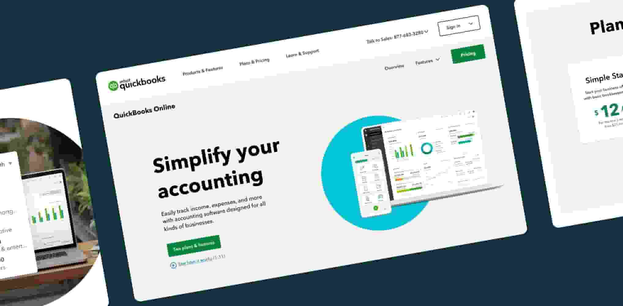
The website is our Grand Central Station with all visitors on their own unique journey—to compare, learn, purchase, and more. Our site must make way-finding feel easy and personalized, surface key campaigns, and act as the primary front door to our product lineup. Our visuals, content, and interactions work together to seamlessly bridge the top and bottom of funnel and deliver experiences both beautiful and beneficial.
Web
Essential libraries & resources
Here you will find libraries and toolkits containing the assets and guidelines you will need to get started.
Web experiences playbook
Team guidelines on standards & metrics, web content guidelines, site architecture and page structure.
Design system training
Learn the design system, our approach to atomic design and how to prepare pages for handoff.

Marketing component library
Your go-to source for built components and brand standards for color and typography.
BAM: Brand + Marketing design
Useful for booking office hours and understanding the teams.