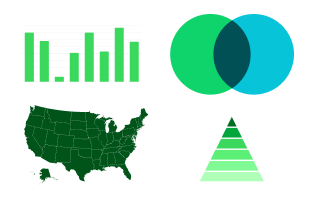
Data visualization is a core part of the QuickBooks Blog. When creating data-based visuals, make design decisions based on the assumption that most readers will have minimal exposure to creating or consuming data sets.
Data visualization
Data visualizations must:
Easily understandable
Scannable
Use appropriate chart types
Conform to style guidelines
Color palette
Consistent color usage is critical for all data visualizations.
Background colors
Color order
Heat map color range
Positive
Negative
Examples
Below, you’ll find various examples of how we visualize data on the blog.
Hardest-hit industries
Company sales strategy
Statutory employee vs. traditional employee
Well-being changes during 2022
Available library
Check out our extensive data visualization Figma library and toolkit containing the assets and guidelines you’ll need to begin.

QB Editorial Data Visualization
Figma components to assist in data visualization for the QuickBooks Blog.
© 2025 Intuit Inc. All rights reserved.
Intuit, QuickBooks, QB, TurboTax, Mint, Credit Karma, and Mailchimp are registered trademarks of Intuit Inc. Terms and conditions, features, support, pricing, and service options subject to change without notice.
By accessing and using this page you agree to the Terms and Conditions.