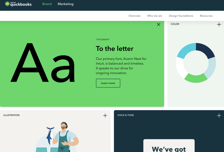
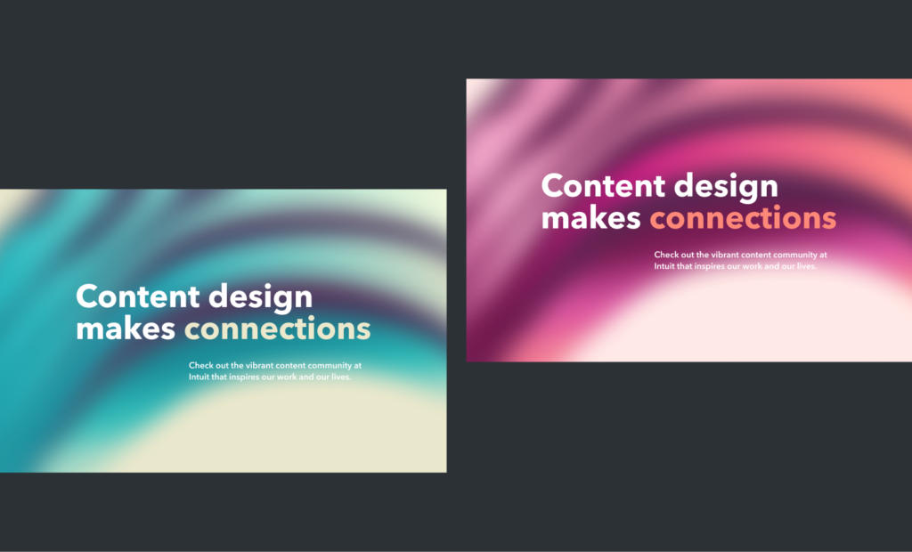
We designed the original version of the Intuit content design community page in roughly six weeks. We (a content designer and a visual designer) were in a rush to create a digital space for the growing content design community at Intuit. This first version got a lot of positive feedback, but we knew there was room for improvement — especially with the hero banner. The hero banner was meant to be a placeholder until we came up with something better. Fast forward two years later, and we were still using the same ol’ thing.
The first hero banner
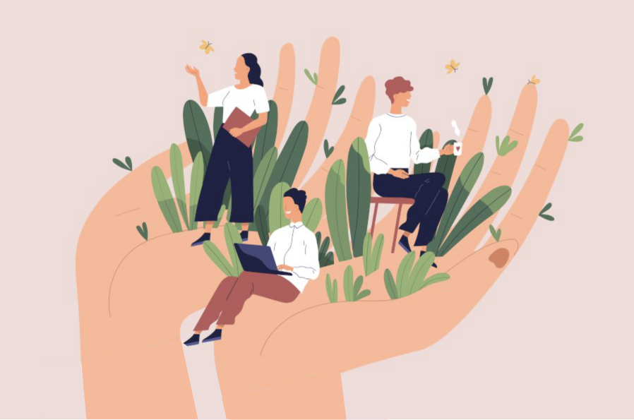
There was nothing wrong with the banner, necessarily, but it wasn’t particularly inspirational. We built the community page as a recruiting tool. We also wanted to showcase the awesome work our content designers do that some colleagues might not get to see. But the first thing you see — this hero image — didn’t shout “come work with us!” It had no point of view and felt generic. Boring. Who wants that?!
When Sarah Mohs and I got the chance to redesign the page this past year, we wanted it to be so bold and different that people had to take notice. How might we push the visual aesthetic so it felt bespoke? Whatever we come up with would set the tone for the page.
The soap story
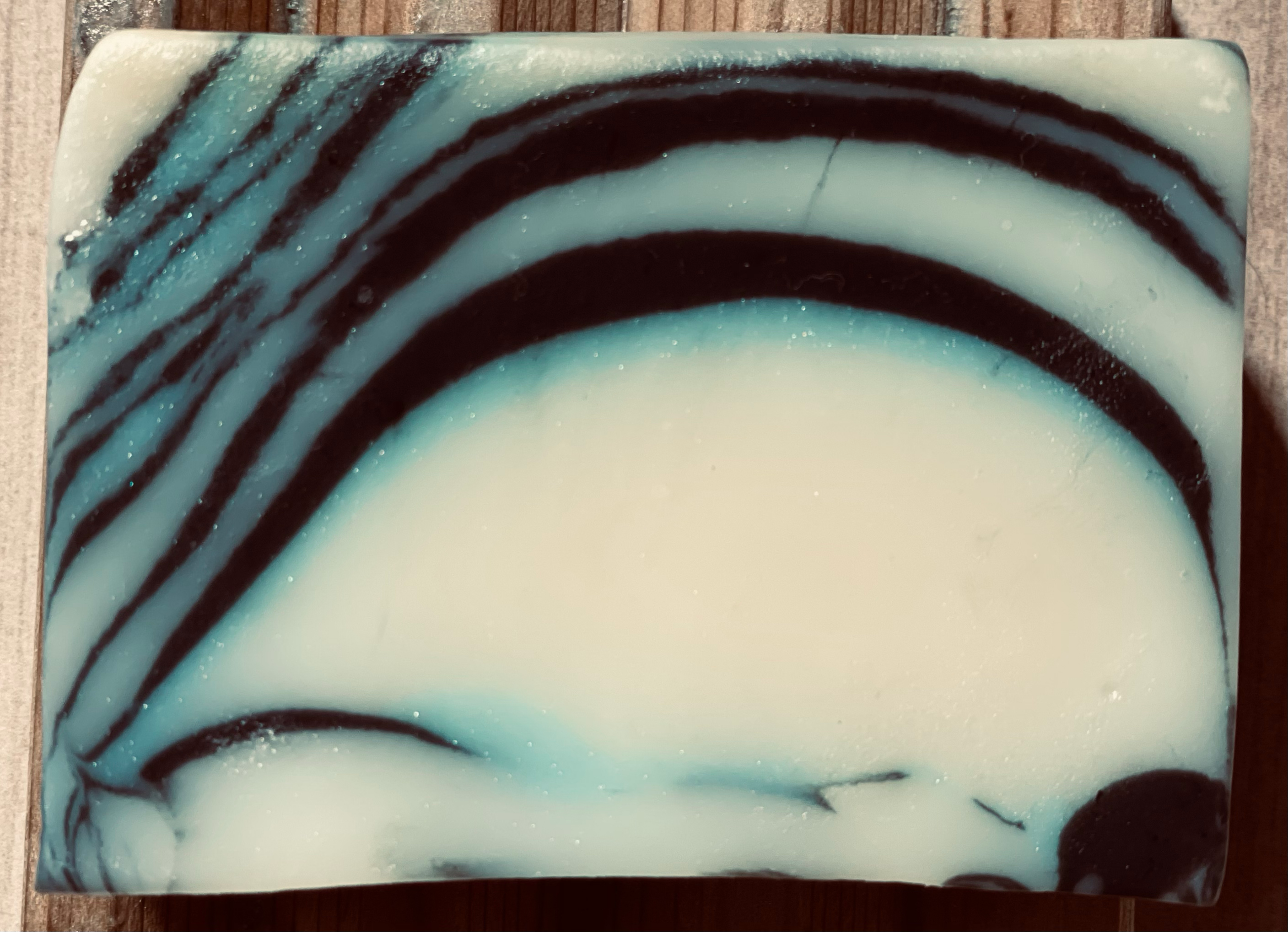
I had ordered a bar of soap on Etsy because of how cool it looked. It had dark paint brush strokes over a blue gradient and cream background.
This soap bar was beautiful. I had no idea what I was going to do with it, but I snapped a photo of it anyway.
As I struggled with the banner, I thought, “What if I just use the soap design? Would that be so terrible?” It might be outlandish or it might be fantastic, but there’s no way to know until I try it. So we explored a few options.
Don’t be afraid to explore trends
I was interested in a new digital design trend called glassmorphism. This technique applies frosted glass and translucent veneer effects to images and objects. I wondered if it could be thoughtfully applied to parts of the content design site, like the blah banner image.
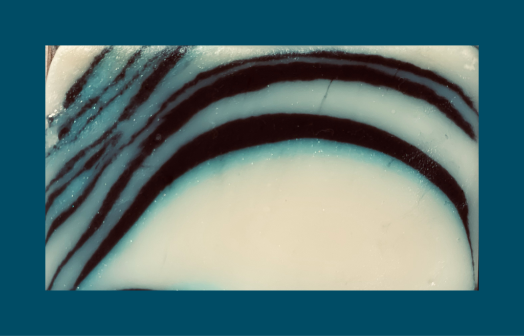
First, we fiddled around with the blue gradients of the original soap design. But they didn’t play nice with the pink palette that we had already established on the site. We replaced the blue colors with Intuit’s secondary palette of pinks and reds.
Kill your darlings
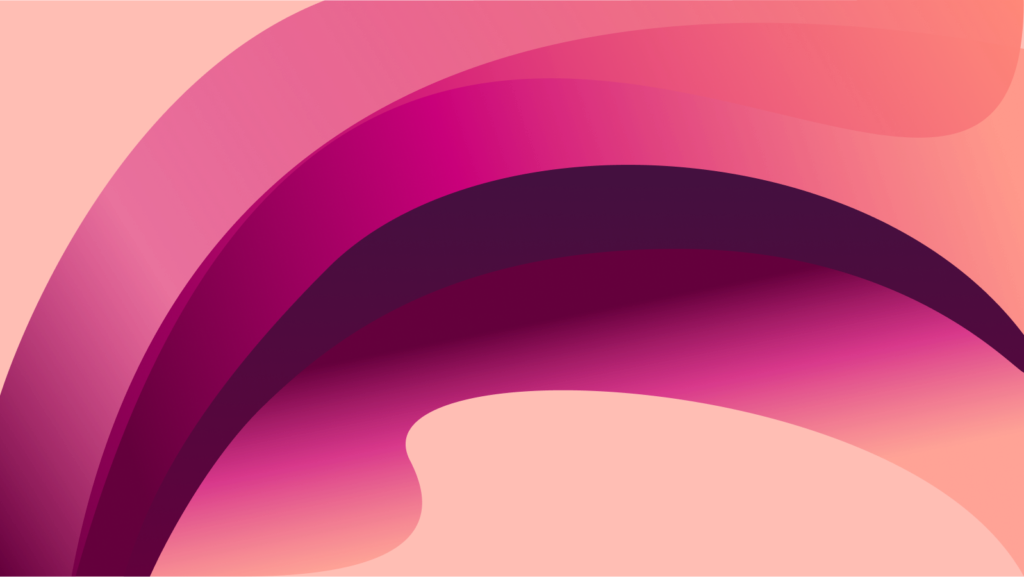
The banner was an improvement, but now it felt busy and overdesigned. Perhaps we were being too faithful to the beloved bar of soap that inspired us.
We simplified some of the details while maintaining the spirit of the soap pattern. We even tried an interesting experiment with geometric shapes overlaid on the “frosted glass” — but it ultimately felt like unnecessary decoration.
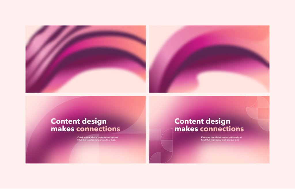
At some point I reduced the blur and we saw more of the design underneath. Then I turned it off entirely. It was clear that glassmorphism wasn’t the right approach for the banner. Even though we both loved this trend and had tried to make it work, it just didn’t. So off it went. We ended up going in the total opposite direction: sharp lines and gradients.
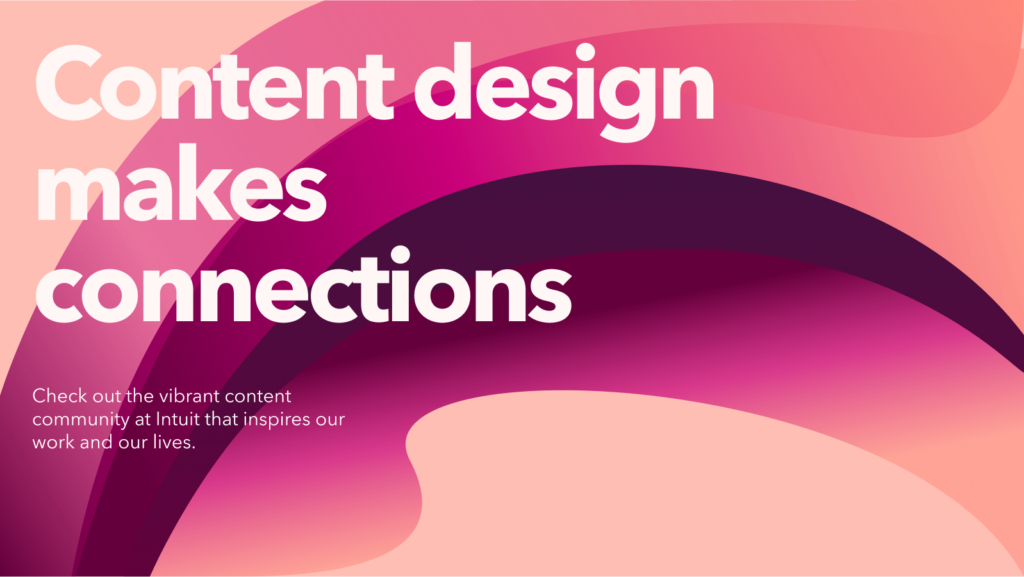
A few months later, inspiration came from another source. I saw a presentation designed by Philbert Widjaja with big, bold typography. It was the perfect addition to the banner.
Find inspiration in the everyday
Inspiration arrives from the places we least expect, like a bar of soap in the shower. When it does, our job as designers is to look and listen. Be on the lookout for anything that might inspire you — objects, colors, toys, artists, cloud shapes—and store them somewhere.
Don’t be afraid to try things that are new and refreshing, even if they seem like they won’t work. I’d rather be told I went too far than not far enough.
So, is the content design banner finally done? Maybe, for now — until the next bar of soap comes along.