In the summer of 2022, right before my 30th birthday, I was finally diagnosed with Attention-Deficit/ Hyperactivity Disorder (ADHD).
I’m not surprised it took as long as it did for me to get help—as a child and adolescent I didn’t have the stereotypical patterns that are associated with ADHD. Things started to shift for me in early adulthood after I graduated from college and lost the structure of school, but it was a slow burn throughout my early adulthood.
Then came 2020.

The chaos that I had been keeping at bay, with what I now recognize as anxiety-fueled overcompensation, threatened to engulf me. Every aspect of my life felt overwhelming, and my usual coping mechanisms simply couldn’t hold. I chalked it up to the intensity and unique challenges of lockdown, but when the pandemic began to subside, my old self didn’t return like I thought it would—I started to think maybe that Natalie had never really existed. I was still overwhelmed with the minutiae of daily life, and, despite starting an exciting new job as a content designer at Mailchimp, my motivation was lagging.
About six months into my job, with essential support from my friends and family, I finally got a diagnosis.
Not an edge case anymore
I started consuming everything I could about ADHD. I read articles about how the ADHD brain works, why women often get diagnosed later than men, how ADHD can make you a better designer, and attended presentations about how to design for cognitive accessibility.
Each article and presentation validated why I struggle in the particular ways I do, boosting my confidence and helping mitigate the shame and stigma I was feeling. Just as importantly, I got a crash-course in how to be a more accessible content designer for cognitive differences in particular.
Cognitive differences weren’t just an edge case to me anymore—it was my own experience, one that was far more common than I knew. 20% of users could be neurodiverse, and “cognitive” is the largest disability category in the United States. Beyond that, users who aren’t diagnosed as neurodiverse could be struggling with grief, depression, major life changes, or other challenges that affect cognition. In general, given the deluge of information we all experience every day, a lot of it negative or overwhelming, we are all to some extent cognitively challenged. No one is truly thriving in this digital environment.
A serendipitous reorganization
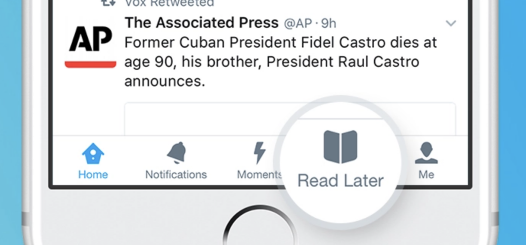
The timing of the reorganization that placed me on my second Mailchimp squad was a happy coincidence. Around the same time as my diagnosis, I joined Mailchimp’s In-Product Discovery (IPD) squad which works on in-app guidance (banners, tooltips, walkthroughs, modals). Each day I was increasing my awareness of cognitive barriers users face, while simultaneously designing and learning about UI patterns that often break UX design best practices and accessibility principles.
IPD is a strange beast, because while they’re made up of UI elements, they don’t always function that way. Product and marketing teams employ them to speak directly to customers from within the UI, but in order to get users’ attention, they often use tactics that don’t harmonize with the user-centric flow that product and content designers have created.

When done poorly, the elements that make up IPD account for some of the most frustrating and cognitively inaccessible user experiences today. We’ve all seen them: interruptive modals that pop up without warning, toast messages that slide into our task flows and are nearly impossible to dismiss, or “alerts” that, upon further inspection, are just ads made to seem more urgent. Even in-line banners are frustrating when the image and copy are too distracting or break up our task flow on the page.
And then there’s the call-to-action (CTA). Often, CTAs are written in such a way that they don’t explain to users where it’s taking them, if they’ll lose their spot in what they were doing, or whether they’ll even remember what they were doing in the first place.
Navigating digital spaces is already difficult enough for users with cognitive differences. There are plenty of UI pitfalls to encounter within apps and websites that can make it feel nearly impossible to complete basic, let alone complex, tasks. Add an additional layer of elements that show up without warning, divert attention from the work in progress, and create unneeded urgency, and you’ve lost the trust and possibly the business of neurodiverse users.
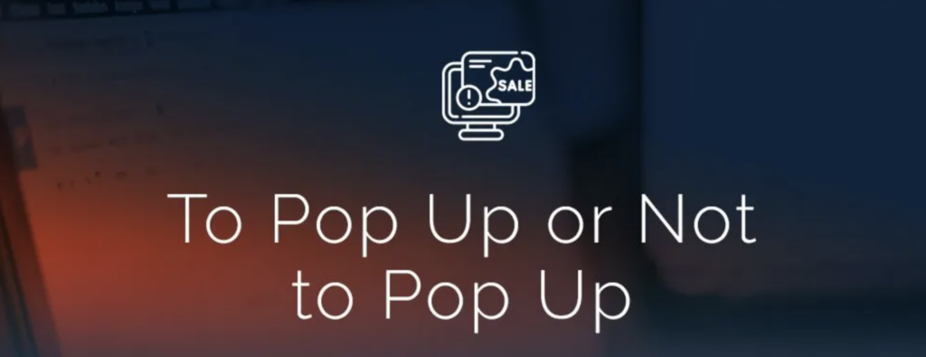
Why do we use IPD in the first place if it’s this frustrating for so many users?
As designers, we work to elegantly strike the balance between business needs and user needs. Nowhere is that tension more apparent than in IPD. The business sees IPD as a way to drive upgrades and reduce churn through direct appeals. Much to my and other designers’ chagrin, pop-ups do work for some people. When a pattern is interruptive, there’s often higher engagement, even if repeated interruption erodes trust over time. The revenue opportunity can simply outweigh the risk of frustrating neurodiverse users.
Also, IPD offers a contextual way to communicate with users as they’re performing a task and give them helpful guidance, which can indirectly reduce churn and improve the user experience. It can be a reinforcement of what a user has read in a knowledge base article or a tip that an onboarding specialist gave them. This can help with working memory problems, something a lot of people with ADHD and other cognitive differences struggle with.
IPD is an opportunity to make software both more usable and profitable, if we keep all different kinds of cognitive abilities in mind when we’re designing it.
This is especially important at Mailchimp, because of our archetypical user: the entrepreneurial small to mid-size business owner. My hunch, based on the fact that people with ADHD are over-represented in entrepreneurship, is that Mailchimp’s user base has a higher-than-average incidence of ADHD. We’ve got a lot of users who have boundless vision, energy, and creative thinking, but with limited capacity to deal with interruptive UI.
So how do we create accessible IPD moments?
In my year of designing IPD as well as learning about ADHD, four principles bubbled to the surface about how to create IPD that someone with a cognitive disability, especially ADHD, would find helpful.
Contextual > Interruptive
Be as contextual as possible with guidance, both in content and form. If you have to interrupt the experience or if the message isn’t directly relevant to the page it’s surfaced on, it should be important from a legal or account perspective, or on a page where the user is the least likely to be in a task flow.
ADHD, though the word “deficit” is in the name, is really an attention regulatory disorder – we actually pay too much attention, but don’t direct it to one place for very long, which means the task at hand doesn’t always get done in a timely way. Our brains are struggling to figure out what the priority is, and interruption immediately puts whatever we’re doing at the bottom of the list so we can attend to the thing that feels urgent. This can prevent task completion, which therefore prevents payoff moments.

Contextual guidance helps us quickly fold whatever the message is into what we were already doing, shortening the time between notification and task completion. It also lowers the perceived urgency, which helps keep us focused on what we’re on the page to do.
If possible, save for later
In addition to contextual guidance, a save-for-later option cues a user that they don’t absolutely need to pay attention to an item at that moment and can continue with whatever they were doing in the app. I personally have two modes: follow each item in front of me down the rabbit hole and lose track of what I was doing, or frantically make everything that feels stressful and distracting go away even if it would have been helpful later. Save-for-later is a middleground: it helps us to prioritize tasks while not outright dismissing them.
The only trick is that once it’s out of sight, it’s also out of mind. A “saved for later” digest in an email at the end of each day or week might keep things top of mind. I’m proud to say we’re prioritizing adding this to our IPD publishing tool, which I hypothesize will make a big difference for users’ knowledge retention and product usage.
If you don’t have access to this functionality in the tool that you use to publish IPD, an alternative would be a “snooze” option and assurance in the copy that you’ll surface the message again.
When in doubt, use a (short) walkthrough
An interactive element that makes you feel like you’ve accomplished something? Check. Breaking information up into small bites? Check. Being transparent about how many steps there are in a task? Check. All best practices for designing for ADHD.
In addition to being more accessible, in our experience at Mailchimp, walkthroughs are also by far our highest performing IPD pattern, averaging a 45% start rate. This is compared against other IPDs that hover in the 3-4% success rate range.
Simplicity
The hallmark symptom of ADHD is the struggle to maintain focus (unless we’re hyperfocusing on something we love to do). If you want ADHD users (or users more broadly) to consume IPD content, keep the cognitive load as low as possible.
It’s tempting to publish a wall of text with a brightly colored image or images—we’re excited about the products we’re pushing users to adopt and want to provide as much context and splash as possible.
If the message is contextual, relevant, and not falsely urgent, you won’t need to rely on bright colors and long paragraphs. If more context is needed, including links to knowledge base articles is a way to reduce the time and effort required to consume the message while still providing an opportunity to dive deeper.

Design for one, design for all
Injecting design decisions with compassion for users of all cognitive abilities, remembering we are all at the whims of circumstance and one step away from falling into a disability category, will translate into trust with your users. Accessibility isn’t an add-on to the design process; it’s part and parcel of creating effective, delightful experiences for all.