Understanding my neurodiversity has been a gift—both in my personal life and in my career as a content designer.
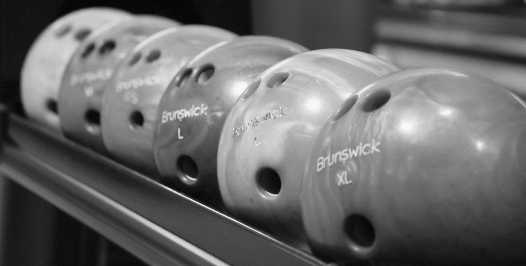
The last time it rained on a weekend, my husband and I decided to go bowling. “I’ll make a reservation!” I offered, grabbing my iPad. He went to the kitchen to make us breakfast.
I went to a bowling alley’s website and my eyes glazed over almost immediately. Choose the date, time, number of people, and duration. How long is a typical bowling session? I wondered. The default time was 2 hours and 15 minutes—did we need that much time for two people?
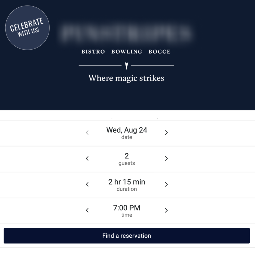
I filled it out the best I could and clicked “Find a reservation.”
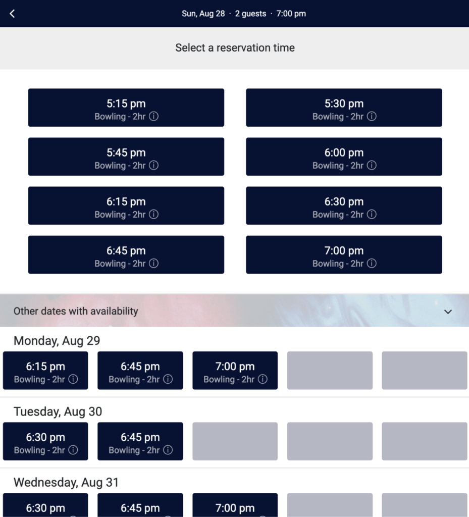
I balked when I got to the reservation screen. I felt overwhelmed with all the options—so many calls to action demanding my attention, little information icons in each box, everything the same color. So much content.
I felt that familiar creeping panic rise as I faced so many decisions. I grabbed a random time I thought might work. Then a modal window popped up.
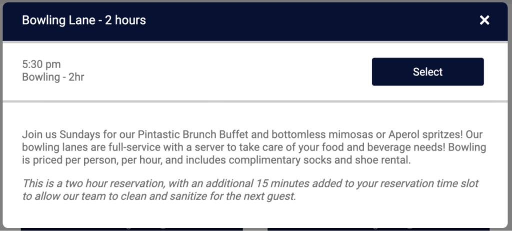
How hard does it have to be to reserve a bowling lane? Do we need food and beverages? Where’s the menu? Is the cost per person? Where’s the price?
I pushed those swirling thoughts aside and selected a lane without reading anything else. Only to be taken to a login screen.
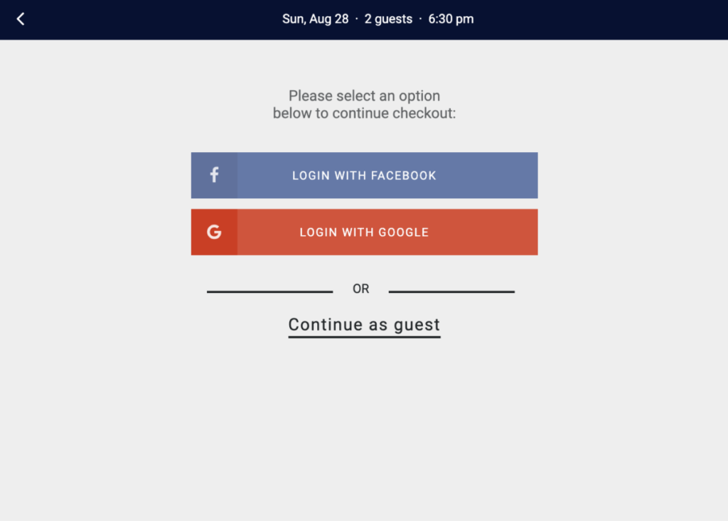
Logging in with Google or Facebook would just lead to more login screens. I continued as a guest. But checking out as a guest presented even more options.
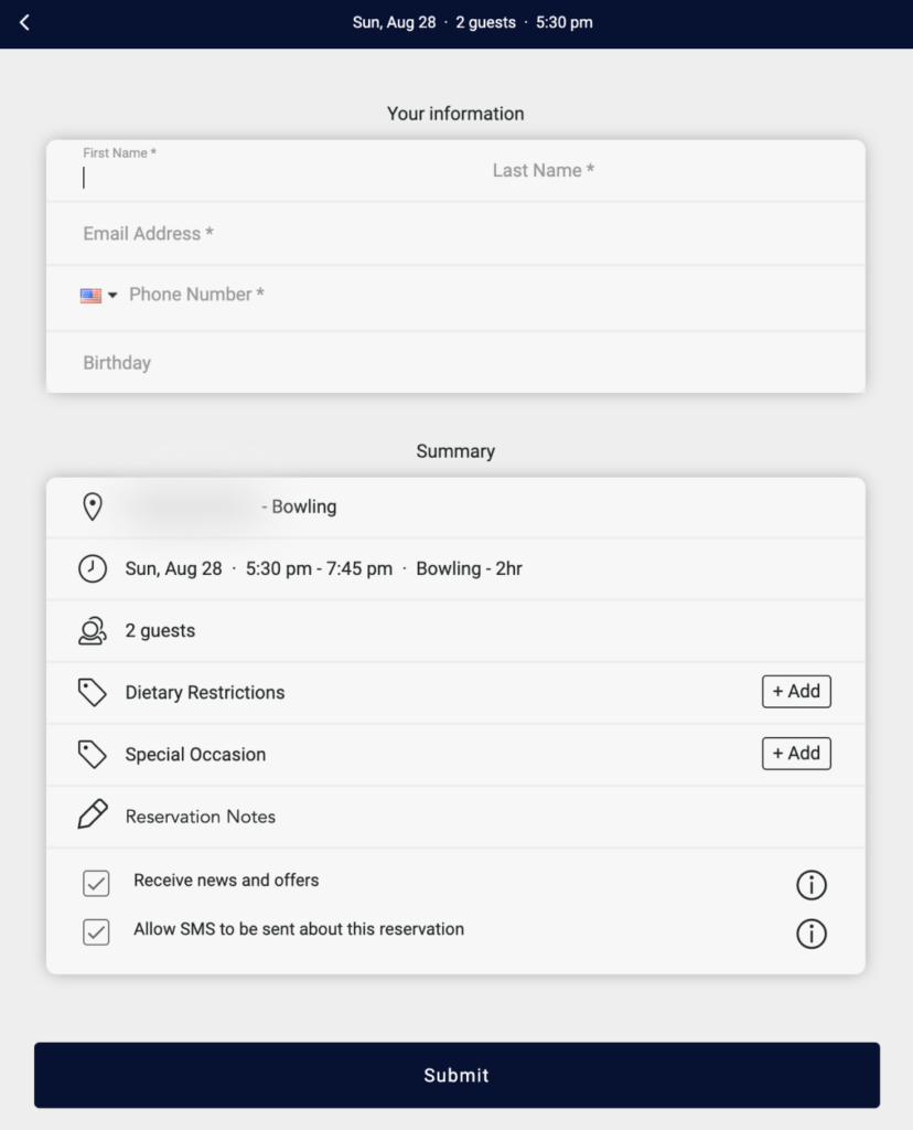
By the time I was supposed to fill out my info, I gave up. I was overwhelmed by choices and decision making. It was taking too long! I checked my email (what I now understand to be a dopamine fix), got distracted by another task in another Chrome tab, closed my computer, and forgot all about bowling.
Later that rainy day, my husband asked what time bowling was. Oops! By the time I went back to the bowling alley website to reserve a time, it was too late — they were all snatched up.
Design flows that don’t overwhelm people
A poorly designed user flow can overwhelm anyone. Folks might struggle through it but eventually complete the task. For people with anxiety or attention issues, however, that feeling of inundation is magnified tenfold.
The bowling example seems so small. Harmless, even! But for me, this wasn’t about a bowling lane anymore — it became yet another example of failure. I tried to do something and failed.
I was diagnosed with ADHD in my 30s — a bit late in life, just like my dad, who was diagnosed at 50, and my brother. I struggle every day to complete tasks. It’s neverending and quickly gets tiresome.
ADHD makes bad UX worse. Luckily, there are ways to address this and create good user experiences for everyone.
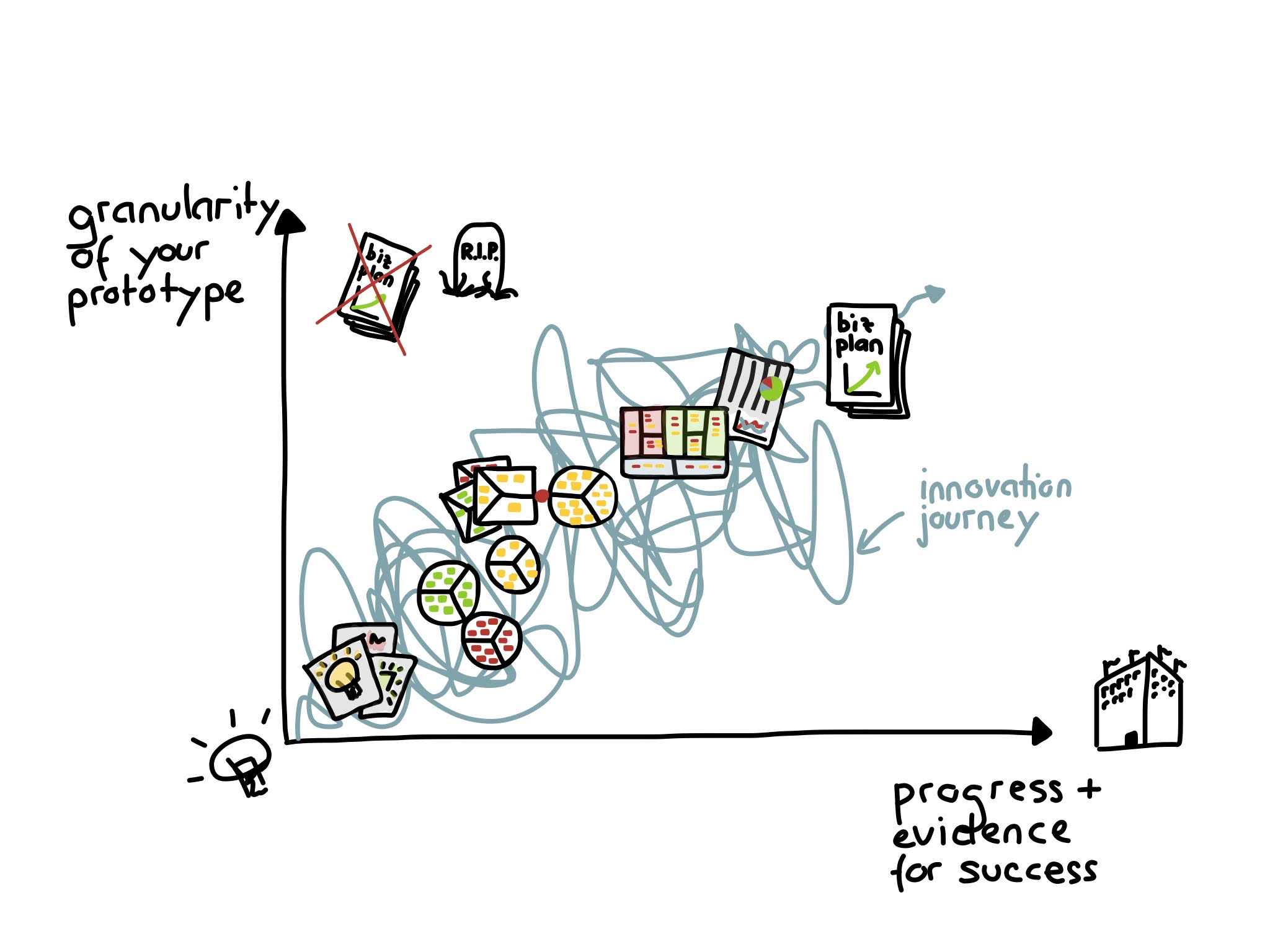
1. Disclose info gradually, not all at once
Progressive or staged disclosure gradually reveals information to users. This is especially important in interfaces with a lot of choices, like menus or settings screens (or, in my case, reserving a bowling lane). Too much info at once can be overwhelming, making it hard to find what you’re looking for or remember what you’re doing.
Progressive disclosure breaks things down into manageable chunks. When you gradually reveal information, it’s easier to pay attention to and understand.
There’s an added benefit of this design for folks with ADHD. Studies suggest that people with ADHD have lower levels of dopamine, the feel-good neurotransmitter. Dopamine is involved in the brain’s reward system and plays a role in motivation, reinforcement, and pleasure.
Simplifying flows into steps gives the feeling of making progress and forward motion. For me, clicking the “next” button makes me feel like I accomplished something, no matter how tiny the task. And it gives me a little dopamine boost, too — a reward, a carrot dangled to encourage me to keep going.
2. Use clear language
Clear, concise language is a foundation of accessible content. No one ever said something was too easy to understand. It’s good for humans, and it’s good for business.
Content Design London’s readability guidelines are chock full of studies and resources that show how plain language is useful. Even the US government has guidelines around plain language. Intuit’s content design system has a whole section with tips for writing small. Guidance abounds.
Here’s why it matters for ADHD: When people start talking to me in jargon, my brain immediately shuts off. I start daydreaming. Then, if someone asks me a question and it’s cloaked in fancy language, I inwardly panic because I forgot what was being discussed.
But clear content is important for everyone, not just people with ADHD. People with cognitive disabilities can have a hard time understanding complex concepts, and people who are non-native English speakers find jargon and dense language difficult to parse. Designing content that’s clear and easy to understand benefits everyone.
In a user interface, if a task is cloaked in complexity, it’s likely I’ll get distracted and abandon it. And if users think a task is hard, they won’t do it. Psychologists call this the perception of complexity.

3. Use visual cues and breaks
When I’m flooded with information, my brain feels like it’s shutting down. Visual breaks can act as dams that slow that flood. This can mean breaking up text with images, using white space to create a visual hierarchy, or using color to highlight important stuff. Bullet points or numbered lists can be helpful, too.
These breaks are vital because my brain is constantly processing information, and I can get quickly overwhelmed. With ADHD, your senses are cranked to level 10 all the time. I can’t tune things out as easily as others. By including visual breaks, users can focus on the most important info.

4. Don’t make users rely on working memory
I wrote a Medium article about how brains work that explored the different types of memory: sensory, working, and long-term memory. Working memory is where our brains are most of the time. It has a limited capacity to temporarily hold information and is important for reasoning and decision-making.
Working memory also helps with executive functioning and completing tasks — which is where many people with ADHD struggle. Here’s how you can lighten the burden as a designer:
- Chunk everything. Use short text lines, headers and subheads, and lots of white space.
- Make form fields accessible. Don’t write placeholder text that disappears when you click into the field. It overloads working memory because it forces you to try to remember what was just there (“what’s the phone number format again?”). Put form field names or instructions near the field itself.
- Use comparison tables if it’s right for your business. They help people see differences visually, rather than keeping all the info in one’s head.
- Use information architecture and navigation as memory boosters. Breadcrumbs are great at helping people remember where they are.
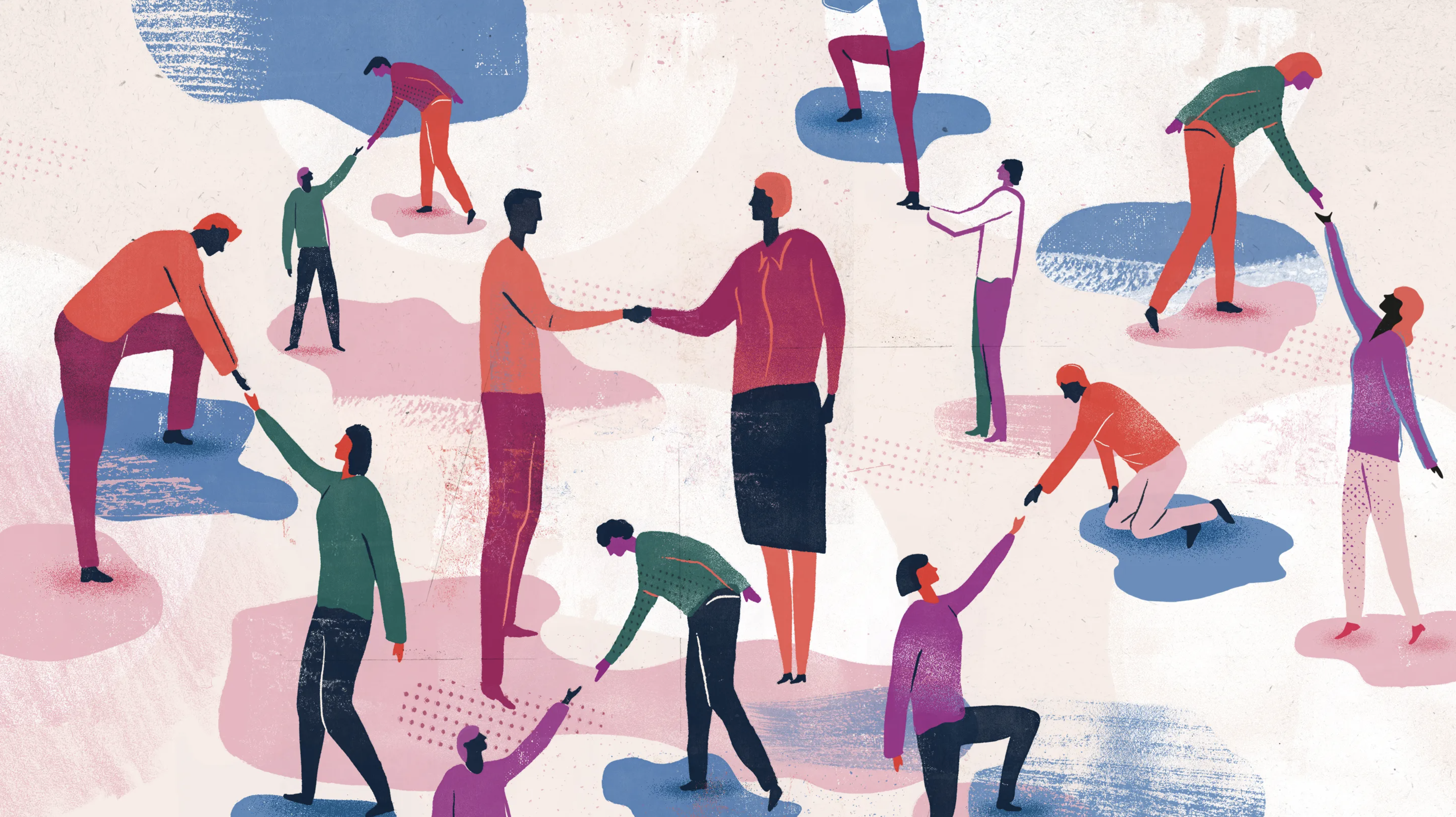
5. Accessible content affects real people
Understanding my neurodiversity has been a gift — both in my personal life and in my career as a content designer. I have a different perspective I can bring to my work. Mostly, it’s given me a lot more empathy for myself and others.
I’ve been in meetings where designers disregard established patterns in favor of a flashy new design. But remember: There are human beings behind UX terms like “cognitive load” and “mental model.” People need those mental models because they create shortcuts. And for people like me who already have trouble with focus and attention, those shortcuts are vital.
Accessibility is more than a box that gets ticked on a checklist. It affects real people, and some of those people have disabilities you can’t see.
A better bowling experience
Back to my bowling example. How could they have designed it differently?
- Use progressive disclosure for the UI by only showing the first few fields, then revealing additional fields as one goes through the reservation process.
- Simplify screens and eliminate fields that aren’t absolutely necessary.
- Hide those extra fields (like dietary restrictions) in an accordion that users can expand if they want. Or condense restrictions and special events into a single “Special requests? Send us a message.”
- Include a visual element like a calendar view.
- Unless there’s a reason for logging in to make a reservation (like points or a membership), remove that step entirely and have everyone check out as a guest.
Then maybe — just maybe — I’d be able to successfully book a reservation and enjoy a night of bowling with my husband.
Epilogue
Fed up with the reservation process, we found a no-frills bowling alley that let us do things the old-school way:
Go to bowling alley. Get shoes. Bowl.
The internet doesn’t make everything better.