Data-driven design is the process of developing or improving a product based on things you can measure. Data tells us a lot about user behavior: the preferences of your users, what they like/dislike, how they interact with products, and what devices they use. However, in my ten years in UX and Analysis, I’ve seen lots of roadblocks to designers using data.
In one example, my team was getting ready to launch a new financial feature. As I usually did in my role, I analyzed data on benchmarks, feature usage, churn, and NPS responses. Armed with insights, I proudly presented my report to the product team.
To my despair, several days went by and nothing had changed in the design. My sophisticated charts weren’t clear to the designers, they didn’t understand why they were looking at data, and they didn’t know how data could positively impact their design process.

It was clear that my method of reporting data was flawed. I was thinking like a robot and didn’t take into account the emotional way that designers think. My presentation was dense with dozens of charts and no feeling. I had to craft a more effective way to communicate data to our designers that they would relate to.
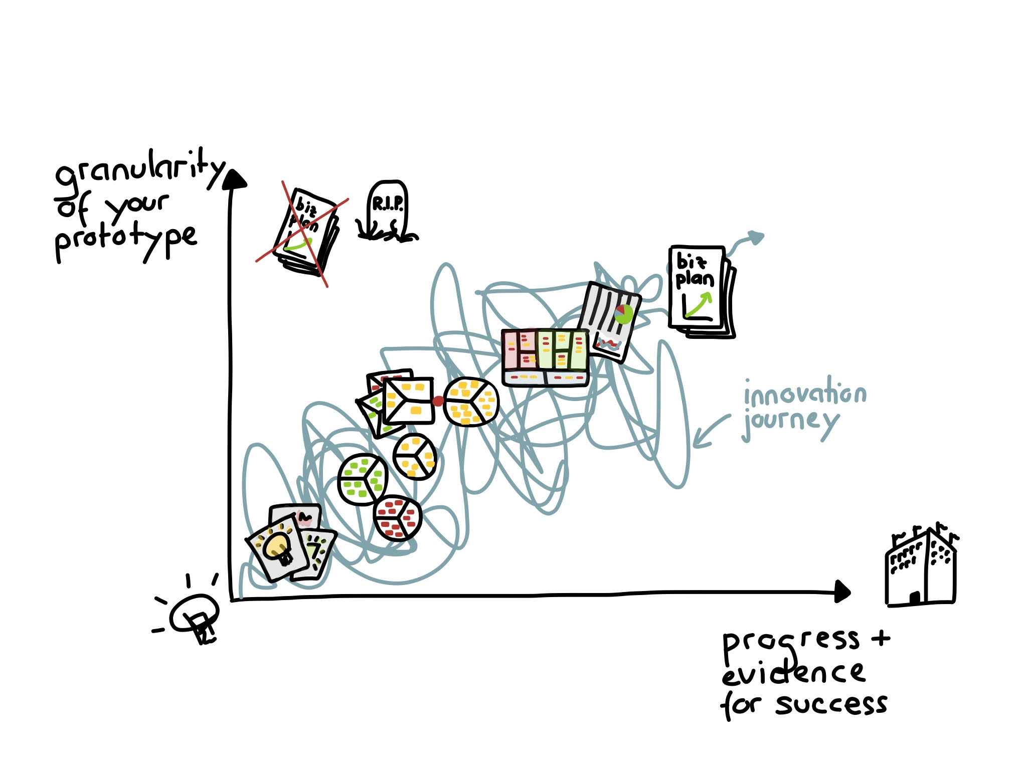
I turned to the HEART framework, developed by a group at Google. HEART is a framework for using data to evaluate the user experience of a product.

This method makes sense of data by helping you align your metrics with user-centered goals. Here is what the framework looks like:
Happiness – How do users feel about your product?
Happiness is typically measured by user satisfaction surveys, app ratings and reviews, and net promoter scores.
Engagement – How often are people coming back to use the product?
We can measure engagement by the number of visits per user per week, session length, or a key action, like the number of photos uploaded or songs listened to per user per day.
Adoption – How many people complete the onboarding process and become regular users?
Adoption is measured by the number of new users over a period of time or the percentage of customers using a new feature.
Retention – What percentage of users are returning to the product?
Retention is measured by churn.
Task success – Can users achieve their goal or task quickly and easily?
Task success is measured by factors like efficiency (how long it takes users to complete the task) effectiveness (percent of tasks completed), and error rate.
When we ask questions about how users interact with the product or what users like or dislike, the data questions make more sense to designers because they connect the information to broader user goals. Framing metrics this way creates a unique connection between UX and revenue-driving metrics, helping to ground designers, researchers, and product teams in quantifiable results.
At Intuit, we know retention is an important driver of customer success, so it’s no surprise that our team has been heavily focused on keeping our Brazilian customers. One of our strategies was to make it easier and faster for users to produce and send invoices. Was it working? We turned to the HEART framework to understand the data.
Our initial research with current QuickBooks users showed how unhappy they were with the invoicing process. Could we improve our happiness metrics? Could we also improve engagement, adoption, retention, and task success metrics?
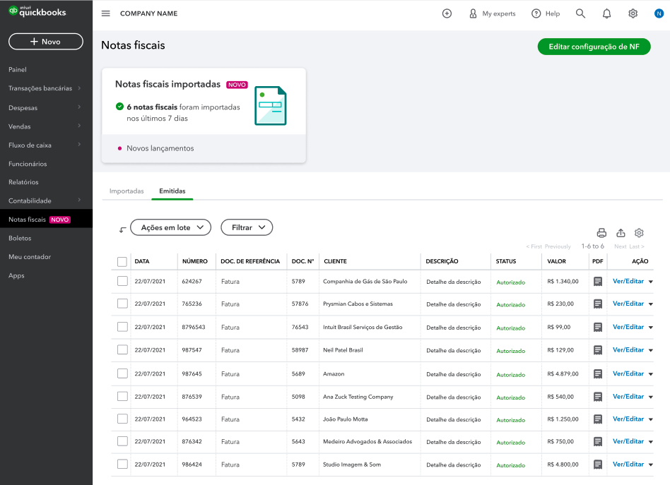
We introduced a new way of creating and sending invoices to a large group of users. The data showed a completely different scenario: users were able to complete tasks easily with small error rates; the engagement, measured with the “level of usage” rate, was high; and the adoption rates were extremely high. Using the five HEART categories helped us see how to make a better design for the user. The HEART framework was a great tool to bring metrics into the design process.
In the future, I’ll continue using the HEART framework. It offers an easy-to-understand process for teams to identify goals and gauge success. And it makes it much easier for data-focused people like me to communicate and connect with designers around design.