
If you randomly selected a highly trained designer and asked them to create a workflow for “bank reconciliations,” it’s unlikely they would know where to start, no matter how experienced they are.
Why? Because “bank reconciliations” is one of the many deeply technical subjects within the world of accounting–-a world that we, as designers, don’t expect to practice as part of our craft. It’s kind of like asking someone who has never ridden a bike to suddenly visualize, design, and build a fully-functioning competition motorbike.
But at Intuit, designers have to live in that world. They are tasked with creating accounting products that require us to analyze bank data, streamline complex financial tasks, and reconcile numbers. Many designers aren’t familiar with the purpose of accounting and its crucial role in a business’ operations, and understandably, struggle to improve the accounting capabilities of our products.
Here’s our story (Michelle and Alysa) about getting designers comfortable with this world.
Meet Michelle
“I’m an accountant-turned-designer, and with this unlikely combination of skills, I eventually became a designer at Intuit. Currently, I’m a Senior Product Designer on the QuickBooks Taxes team, designing tax workflows for small businesses and the self-employed.
Our fearless design org leader and Director of Design, Shailesh Shilwant, gave me this challenge: How might you transfer your knowledge as a former accountant to others on your team?
When I first changed careers, I thought I was leaving my accounting days behind me, but here I was in a position to educate my peers so they could do their design work better. I never thought I would be teaching accounting to anyone, let alone teams of people, but it’s been rewarding to utilize my accounting knowledge for different purposes. Challenge accepted.”
Where to start?
Accounting is a massive topic. I needed to whittle down a subject that universities spend years teaching students into something digestible for busy working designers. I started by asking myself:
- What is the key problem I’m trying to solve?
- How could I make this be different from other accounting presentations or courses?
To answer the first question, I thought about the moments when I felt most uneasy about the lack of understanding for accounting, particularly when teams seemed to view it negatively. It’s difficult to build something that you don’t fully appreciate. I realized I needed to start with the basics and define accounting. The key problem I was solving was getting the people who were building accounting products to understand why accounting mattered.
To make sure I was adding value, I considered other accounting trainings that already existed for employees. While these trainings were incredibly thorough and detailed, they overwhelmed rather than empowered designers. They were taught similar to how real accounting courses are taught.
I wanted to teach accounting concepts—but from a product perspective, filtering for what would be most relevant to designers. Teach the basics, but always tie the learnings back to the product.
Narrowing the scope
I thought carefully about what accounting concepts would be most relevant to our teams. I didn’t expect everyone to be experts by the end of the workshop. Instead, I hoped to increase their shared context for why the problems they solved for customers mattered in the first place.
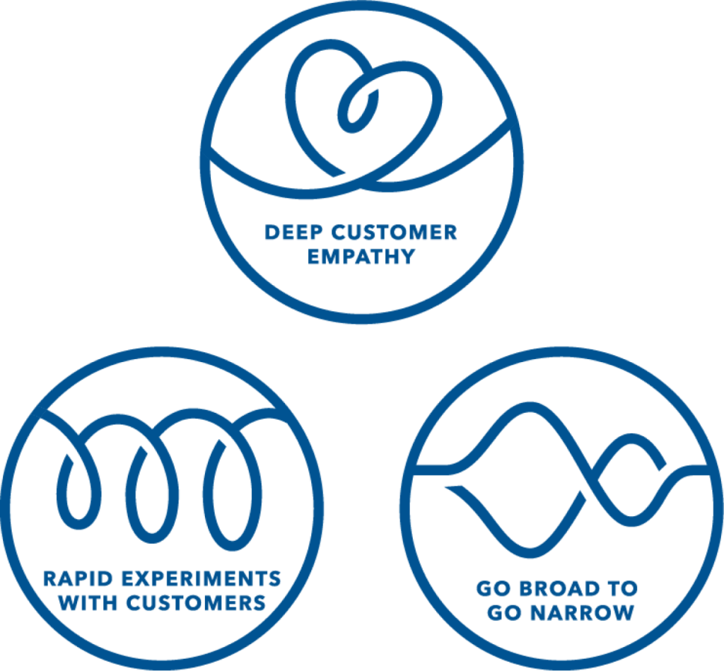
I was using Intuit’s D4D process (Design for Delight) by “going broad to go narrow.” First, I brainstormed all the accounting concepts I could teach, no matter how complex. Then I narrowed my focus onto what would be most impactful to empower designers dealing with accounting. The ultimate goal was to help my colleagues design with confidence. If I could help just one designer feel just a little more comfortable designing a highly complex accounting workflow, I would have achieved my goal.
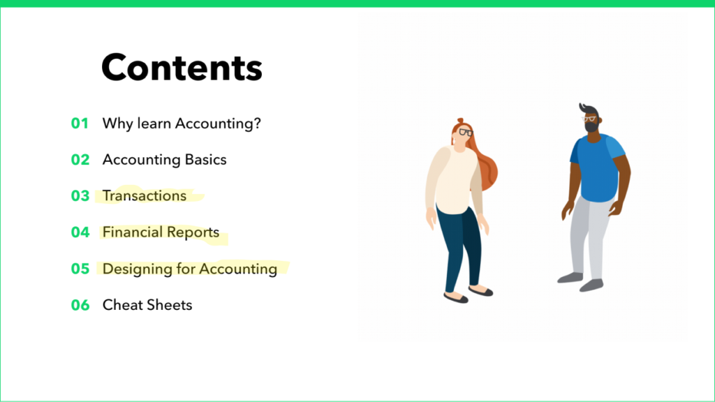
I narrowed the scope of this training to
- Transactions
- Financial reports
- Double-entry accounting
Going broad to narrow also helped me hone in on the problem I was solving. Existing training opportunities didn’t effectively teach accounting to visual learners and didn’t tie learnings back to the actual product. Product teams were left to themselves to figure out how to apply abstract accounting concepts to the actual products they were building.
Great things come out of partnerships
At this point I had a rough draft of a slide deck, but I knew it needed some love and a fresh pair of eyes. I found a perfect partner in Alysa, a Senior Product Designer with superpowers in storytelling and visual communication. She came to the project with empathy for learning accounting, as she had recently joined the Accounting Automation team and had gone through the experience of learning accounting as a designer. We had immediate synergy and were able to play off of each others’ strengths, which later showed up in our end product — the workshop.
Meet Alysa
“I spent the last 2.5 years on Intuit’s Brand Experiences & Storytelling team, where I specialized in experiential visual design for storytelling. When I joined the Accounting Automation team, I was ready for a new challenge. With Michelle determining what areas of accounting to teach, I focused on how we could make the workshop interactive and bring the concepts to life. Merging both of our superpowers, Michelle and I were able to create something we were both proud of. With the encouragement of Shailesh, we teamed up to create the first Accounting 101 workshop for designers at Intuit.”
Uncharted territory
As designers, we knew most creatives tended to be visual learners. Yet the existing training materials for products like QuickBooks and TurboTax were full of jargon, acronyms, numbers, and complex diagrams that overwhelmed rather than clarified. This was an opportunity to create a deck designed specifically for visual learners and taught accounting from a product perspective.
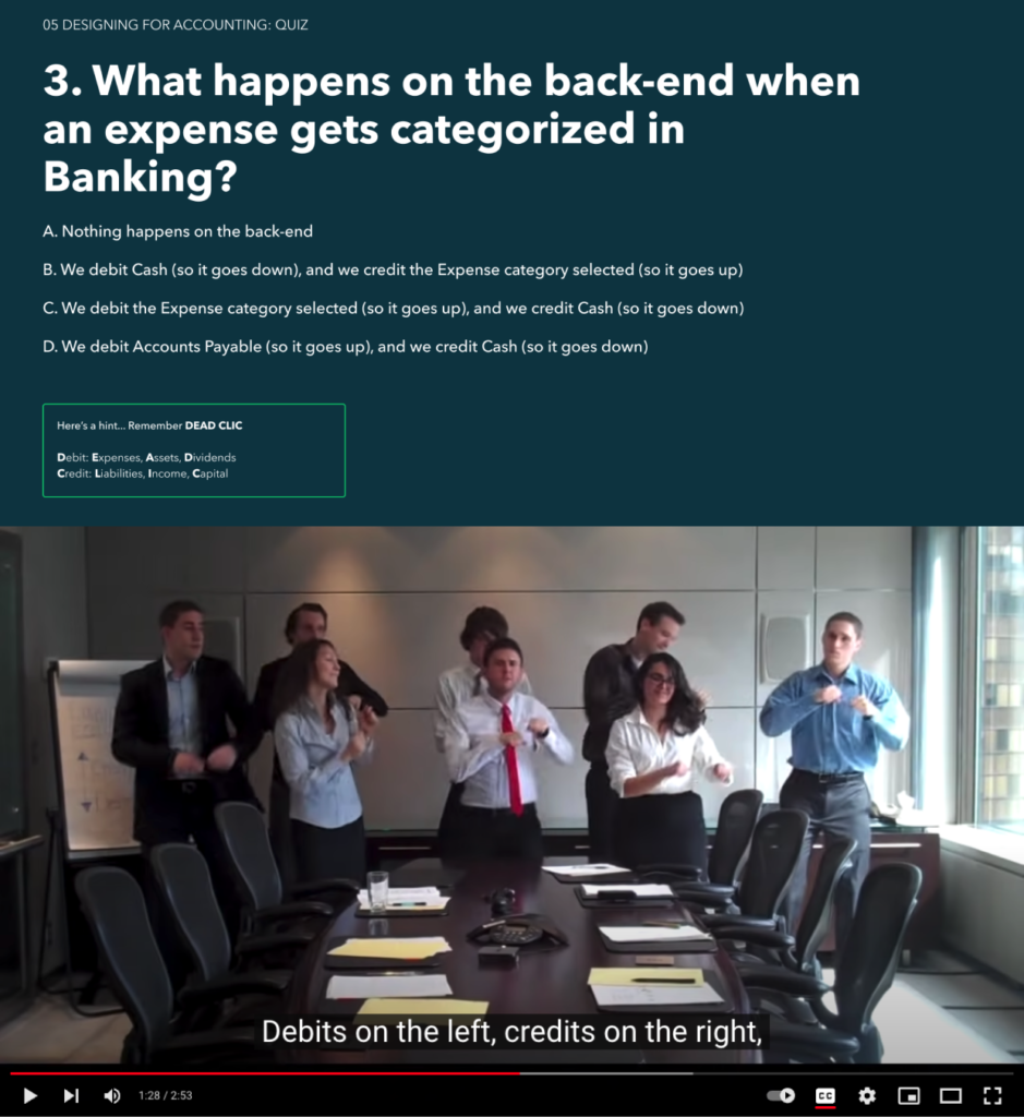
Neither of us had ever designed a class curriculum before, let alone an accounting class. We looked up various teaching methods for inspiration, and scoured the internet for funny videos and TikToks to make accounting lessons more memorable. We created quizzes, exercises, and mnemonic devices to help reinforce the key takeaways.
We presented the initial version of the deck to our immediate teammates to get some feedback and were met with a lot of excitement. Our peers were enthusiastic about the deck and this reaction ultimately led to a bigger decision and a bigger project: to make this an interactive workshop.
The initial feedback also supported our theory that most designers were visual learners. Our colleagues seemed to most resonate with the slides containing simple diagrams and illustrations. Many told us they experienced an aha moment when seeing our visual diagram of where accounting fit in a business lifecycle. We also received positive feedback on the use of storytelling and a user persona to help designers gain empathy for small business owners using QuickBooks.
We continued to iterate on the workshop in real-time, applying learnings from each cohort to make necessary changes to the curriculum. It was like any other design exercise, except instead of designing an accounting workflow, we were designing an accounting curriculum. In both cases, we need to empathize with our audience (workshop attendees or software users) and see the experience from their perspective. As we built the workshop, we realized it could be helpful to anyone working at QuickBooks, including product managers and engineers. With this, we expanded our view of the audience.
Finally, to allow us to focus on our true value-add (which was helping attendees connect the dots between accounting principles and the actual product capabilities), we leveraged existing learning materials, including:
- Intuit tutorials posted on YouTube—these were meant to help customers get acquainted with QuickBooks (they were just as helpful for designers trying to learn about the product).
- Intuit’s universal sample company—this let us demonstrate how things worked in the product, since this was already used in training sessions to mimic the customer experience.
Drawing the line
One of the biggest challenges was deciding where to draw the line. As we tightened the curriculum, materials that didn’t fit into the workshop went into a cheat sheet section. It included a glossary, a list of resources, FAQs, and other useful information about QuickBooks capabilities. Product teams could use the cheat sheets in their day-to-day whenever they had a question about accounting capabilities in the product. These cheat sheets became a living document, with more content being added whenever a question came up.
So, are we all accountants now?
Not quite! But you’d be hard-pressed to find a group of designers more accounting savvy! We’ve accomplished our goal of increasing shared context and empathy amongst our teams. So far, we’ve delivered the workshop to 50+ designers, PMs, and engineers. Since our initial pilot, there has been global excitement amongst colleagues in other countries as well, including colleagues in the UK and in India. Our next challenge will be scaling the workshop and to serve our global teams with the most efficiency.